


Long Box:
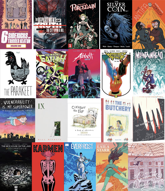
6 Sidekicks of Trigger Keaton
Writer: Kyle Starks
Artist: Chris Schweizer
Color Assistant: Liz Trice Schweizer
Publisher: Skybound (Image)
Why It Went In The Long Box:
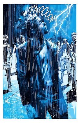
They say to never meet your idols, and Six Sidekicks of Trigger Keaton takes the forewarning of the infamous yet proverbial idol and turns it sideways into a story so bizarre you can’t help to wonder who it’s titular character is a cover for. Other times, reading a comic book needs to be none other than a good old fashioned who-dunnit sort of thing. From the minds of Kyle Starks and Chris Schweizer come this sometimes absurd but always hilarious slapstick action-comedy miniseries that uses the aging dilemma of toxic masculinity within Hollywood (or anywhere else, really) and turns it into a wild ride chock full of laugh-out-loud moments and unforgettable characters. It’s a bit of a swing and a miss realization that this series didn’t keep going beyond its six issues after the case was …”solved” (?). Though I’d be remiss to say that in spite of this, regardless of its short run, it packs a solid punch immediately on page one and doesn’t let up. Schweizer and Starks have brought to life six unforgettable and instantly likable characters, literally characterized by their given Keaton sidekick sequential, not to mention the newly deceased Trigger Keaton. This is a book that is nearly impossible to put down and leaves you (as I already mentioned) wanting more. Car chases, karate fights, a cast of unlikely cohorts, and a perfectly timed “yellow-bellied” repeat offender, this story has it all.Abbott 1973
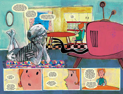
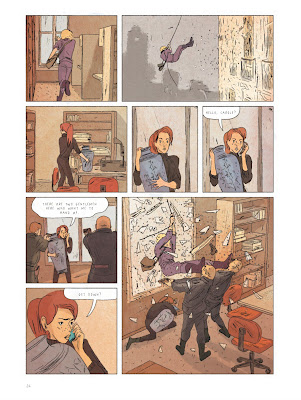
Writer: Saladin Ahmed
Artist: Sami Kivelä
Colors: Mattia Iacono
Letters: Jim Campbell
Publisher: BOOM! Studios
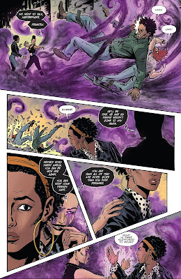
Why It Went In The Long Box:
The Antifa Super Soldier Cookbook
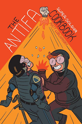
Writer & Artist: Mattie Lubchansky
Publisher: Silver Sprocket
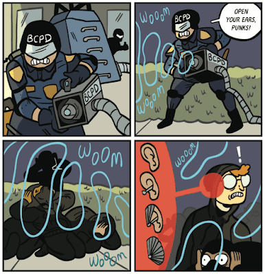
Why It Went In The Long Box:
The Butchery
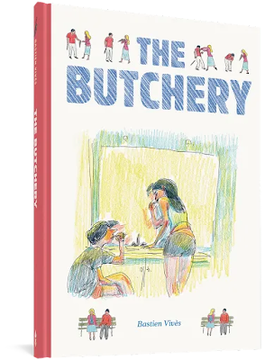
Writer & Artist: Bastien Vivès
Translator: Jenna Allen
Publisher: Fantagraphics
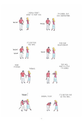
Why It Went In The Long Box:
Conquer the Day
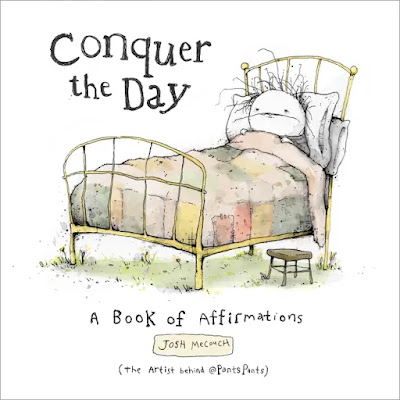
Writer & Artist: Josh Mecouch
Publisher: Harper Collins
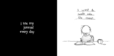
Why It Went In The Long Box:
The Department of Truth
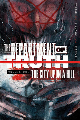
Writer: James Tynion IV
Artist: Martin Simmonds
Letters: Aditya Bidikar
Publisher: Image
Why It Went In The Long Box:
Everfrost
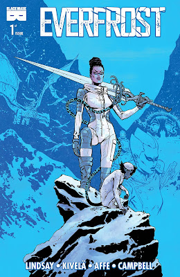
Writer: Ryan K. Lindsay
Artist: Sami Kivelä
Colors: Lauren Affe
Letters: Jim Campbell
Publisher: Black Mask
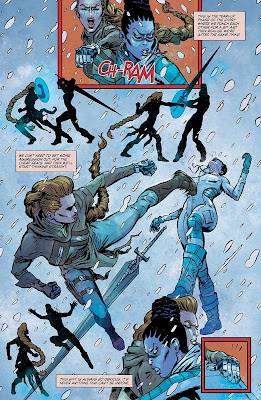
Why It Went In The Long Box:
The Grande Odalisque
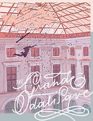
Story and Art: Bastien Vivés, Florent Ruppert and Jerome Mulot
Colors: Isabelle Merlet
Translator: Montana Kane
Publisher: Fantagraphics
Why It Went In The Long Box:
Earlier in the year I did a Quick Hit for the site after I read this one for the first time. I called it “the highlight of your reading year”, an “atmospheric joyride”, and “a sarcastic and sexy heist story that is fun as hell”. Alex, Carole, Clarence and Sam are a cast of characters that immediately bring urge for the traditional fan-casting. And when I say “traditional”, yes I do mean that I do this when I see the need for such things. Don’t question it and don’t argue. Just run with it and don’t look back. But as for this book, Bastien, Florent and Jerome are new to my reading arsenal and seem to be relatively new to western comic culture. Their eastern tradition of telling stories, both in narrative and with illustrations, are the welcomed addition to what’s already accustomed. If you read only one non-caped or cowled comic this year, make it be this one.The Hand of Black

Story and Art: Martin Cendreda
Publisher: Fantagraphics

Why It Went In The Long Box:
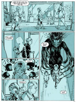
A silent horror anthology comic of sorts is what The Hand of Black is designed to be. Cendreda is an animator by trade who pays his bills working on popular syndicated cartoons, and this book is the first time his strips have been collected in this fashion. A series of vignettes drawn in red, white and black, these short stories have the perfect amount of fear instilled in the thread of each of the seven strange and eerie stories. As a fan of horror, I found this book to be particularly enjoyable due to its unique presentation while within this genre. Often times horror tends to rely on visual presentation to scare you; creating the scariest of monster and spookiest of backgrounds to jump-scare you. These stories by Cendreda rely far less on the art to make you scared out of your wits and a whole lot more on script to make you uncomfortable. Not so much in a way that will make you lose your lunch, but instead in a way that is smart and long-lasting. I highly recommend this to those of you who appreciate a good scary story. Not the gore and monster type, but the twisted Twilight-Zone crafted sub genre type.Karmen
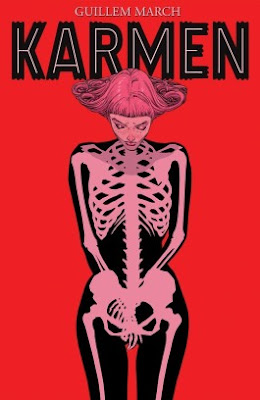
Story and Art: Guillem March
Publisher: Image

Why It Went In The Long Box:
The Many Deaths of Laila Starr

Writer: Ram V
Artist: Felipe Andrade
Publisher: BOOM! Studios
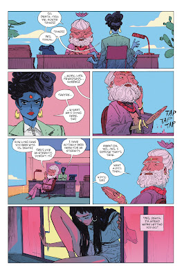
Why It Went In The Long Box:
Coincidentally, this next comic on my list is also about death. But instead of it being somber yet enlightening, it is quirky, light, and airy. Death loses her job when humanity learns of immortality. Now, cast away to earth to live out her days remaining, Death must now find way to change the fate of humanity so as to maintain her own destiny as Death herself. This absolutely bonkers premise paired to the surrealistic stylings of Andrade’s art are what made this such a fun read. Ram V always seems to find a way to make a story stick it’s landing. This one was no different and with Andrade pushing pencils and brushes doing the heavy lifting to tell the story with Death as it’s titular character was no small feat. I look forward to more collaborative work between these two.The Nice House on the Lake
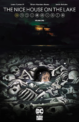
Writer: James Tynion IV
Artist: Álvaro Martínez Bueno
Colors: Jordie Bellaire
Letters: Andworld Design
Publisher: DC Black Label
Why It Went In The Long Box:
Porcelain
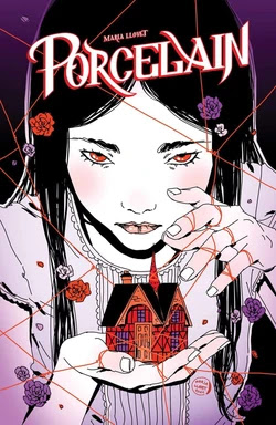
Story and Art: Maria Llovet
Publisher: Ablaze
Why It Went In The Long Box:
Maria Llovet’s lines are damn near the best lines in comics right now. Llovet is quietly becoming the most prolific and underutilized illustrator around. Porcelain makes this heady proclamation in grandiose fashion as visuals are packed overwhelmingly tight on every single page within every last panel. Sideways becomes upside-down as the story moves forward. Story begins with a young girl putting one foot in front of the other as she does what most do when near her age; fantasizing about the who the what the when and the why-for. Eventually, magic surrealism appears and swift her away as she finds herself the newest fixture in a dollhouse with no doors. Every window is one to the next room, but none to the outside, she becomes trapped in a place a few paces past creepy without edging beyond despair. I found this story (which I later discovered it to be a colored version of the black & white original from 10 years ago) especially engaging visually; something I often admit to when reading a book by Llovet. Luckily for us, the story is also always nearly just as euphoric.The Silver Coin
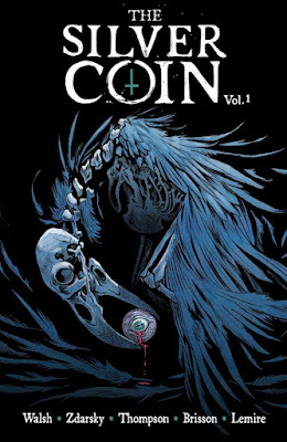
Writer: Michael Walsh
Artist: Chip Zdarsky, Kelly Thompson, Ed Brisson, Jeff Lemire, Josh Williamson & Ram V
Publisher: Image
Why It Went In The Long Box:
Ok. This one is arguably the best horror anthology from a mid-tier publisher being put out right now. Competition is sparse, while also steep within this personal favorite category at the moment. With few taking stab at this sub genre and fewer others making it scream issue after issue, it speaks volumes to be labeled the best in the category in any given year. If you know me on any personal level you probably are aware of which horror anthology The Silver Coin leapfrogged over, and I assure you that this-book-whom-will-remain-nameless is still among my favorites. It’s just that The Silver Coin has brought a fresh new trope to the horror anthology aisle and I am sitting here with my chin resting (and shivering) in both of my palms, elbows on knees. Walsh, sir, you have got my attention. Now, keep collaborating with these stellar writers and passing that scary coin around.Vulnerability is my Superpower
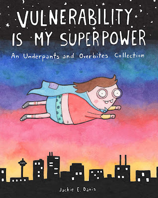
Story & Art: Jackie E. Davis
Publisher: Andrews McMeel
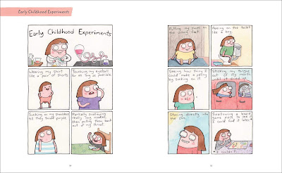
Why It Went In The Long Box:
I bought this one for my daughter. Turns out I loved it almost more than she did. This quirky collection of strips from comic newcomer Jackie Davis is the diary comic that we’ve all been waiting for. Oh? But you weren’t waiting for anything, you say? Visit underpants and overbites dot com then try to convince yourself of that same argument. Jackie’s relatable comics about everyday life are about as hilarious, if not awkward and embarrassing (but still hilarious) as they come. I still let my daughter keep this book in her bookshelf, but I made it clear that dad will be borrowing it from time to time. Because we all need a little reminder sometimes that the best way to get through a sticky situation is to find new perspective and laugh a little. Even if it is at yourself. Thanks, Jackie, for providing this reminder and letting people like my daughter and I into your corner of the world.Short Box:
IN.
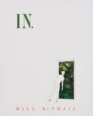
Story & Art: Will McPhail
Publisher: Houghton Mifflin Harcourt
Why It Went In The Short Box:
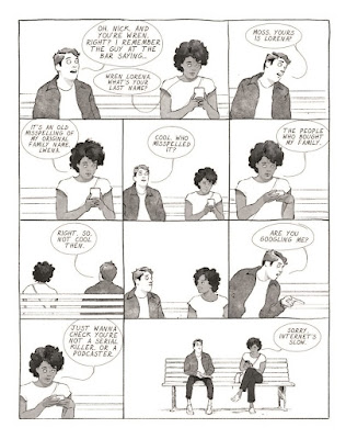
Straighten your ties, folks. There’s a graphic novel on the list by a cartoonist from the New Yorker. All pretentiousness aside, Will McPhail’s IN. was a complete surprise for me. I knew I was going to enjoy this book going in as I was vaguely familiar with his single panel work, as was I also up to speed with the solicit when I saw the eye-catching cover art to this graphic novel. Turns out… Dude can knock you flat off your feet. This story hits hard and hits often. When the dialogue asks hard existential questions like “who are we performing for?” and pivots immediately to a moment of grief, turn the page and next up is an awkward conversation with the plumber in your bathroom. Turn a few more pages and you’re making friends with a stranger on the bus only to find some humor in self-depreciative hindsight after the coffee gets cold. This book is a roller coaster of a ride, but it’s a ride with a purpose. The solid ending to this story settled deeply intimate with me and I found it ironic I didn’t see it coming since the reason I picked this book up at all was because of the artwork on the cover.Mountainhead
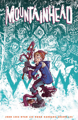
Writer: John Lees
Artist: Ryan Lee
Colors: Doug Garbark
Letters: Shawn Lee
Publisher: IDW
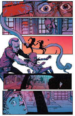
Why It Went In The Short Box:
John Lees is one of my favorite horror writers right now, and Ryan Lee is now one of my favorite illustrators. These two guys together told a story so far-fetched and monstrous that a global pandemic couldn’t even stop it from reaching at least my year-end favorites list. Sneaking in very early this year, the collected volume of Mountainhead brings zero controversy with it to be on this list to represent 2021 comics. That is, of course, your rules are different than mine which is besides the point since this is my time and not yours. This book is a riot. Things start off with a boy and his dad (but not his dad ..read the comic ..you’ll see) raiding a house right up to the point of them getting arrested . Then things get deep, they get twisted, and arms and legs become …octopus appendages. This isn’t like most of Lees’ other work. And I don’t imagine this could have been made without the collaboration with Ryan. The artistic style and character emotions that are infused throughout are nearly impossible to describe. I’m already reading pretty much anything that John Lees does. Now add to that any book I see with the name Ryan Lee on it also.The Parakeet
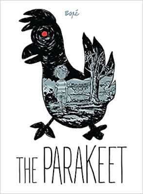
Story & Artist: Espé
Publisher: Graphic Mundi
Why It Went In The Short Box:
Wasted Space
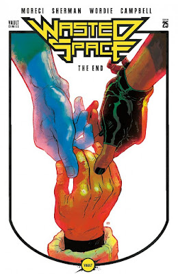
Writer: Michael Moreci
Artist: Hayden Sherman
Colors: Jason Wordie
Letters: Jim Campbell
Publisher: Vault
Why It Went In The Short Box:
Reading Wasted Space from issue one until it’s recently published issue 25 was like watching a child grow into themself. Hayden Sherman has become a master at their craft. Panel layout and linework and overall presentation in their work has gone to levels unimaginable. I was a fan of Hayden’s long before this measurable difference in their craft, so to say these things should not suggest any previous mediocrity. Instead, this is a moment I’d prefer to take to acknowledge the heights of which Hayden has taken this space saga and let it soar. Hayden made this comic sing. They made it explore every page. Especially in the latter issues. Moreci always had a massive story to tell with Wasted Space. We should all feel fortunate that Vault decided early on to give this story the ..space! to get there by announcing during the first arc that it’d get 25 total issues. About three years later and we’ve reached the horizon. The story has ended, and from where I’m sitting I turned the final page with a smile on my face after seeing happen what I never even anticipated would. This series is a hidden gem, a modern sci-fi classic, among the best of all the planet-hoping masterpieces, and most of all it is a fictional story that makes you read Fuq-bot phonetically at least a dozen and a half times.The Wrong Earth: Night and Day
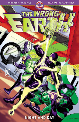
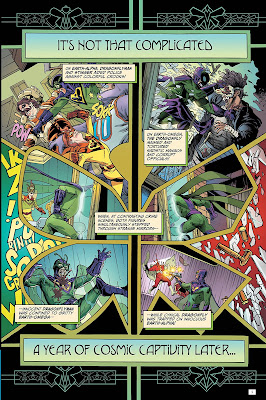
Writer: Tom Peyer
Artist: Jamal Igle & Juan Castro
Colors: Andy Troy
Letters: Rob Steen
Publisher: Ahoy


![Sweat and Soap [Ase to Sekken] by Kintetsu Yamada](https://blogger.googleusercontent.com/img/b/R29vZ2xl/AVvXsEgMnQltxjWqGS1_duhCp9Er1a0NbALuSFrqvjaV4_PjN_w67xCGghYt-l0qKyqTH7Ei7gbq_mxVq8aPAuOiyaArwAMLJWhpGmOYaARUBnwvjmv2-ZIe20m_zR5CvKnPdI6US_AuOnmi3gSX/w680/57525895-BA7E-4EF8-9FE4-89F9C164E1A4.jpeg)