


20. The Dreaming
Simon Spurrier – Writer
Simon Spurrier – Writer
Bilquis Evely – Line Artist
Mat Lopes – Color Artist
The Dreaming has been the strongest of the newly launched Sandman universe books, and it’s no surprise considering its superb team. Si Spurrier is a great choice to helm this title because he’s established himself as the kind of writer who handles complex characterizations with the necessary layered approach. He’s also shown that he can embrace character legacy while still providing a new perspective. Bilquis Evely is one of my favorite artists working today. I adore her detailed yet surreal lines and her use of shadows emanating from her characters. I also appreciate that Mat Lopes generally keeps the color scheme light. It would be too easy to make this book dark, but this book is expressive and vibrant.

19. Animosity/Animosity: Evolution (Aftershock)
Marguerite Bennett – Writer
Rafael de Latorre, Eric Gapstur – Line Artists
Rob Schwager – Color Artist
Rafael de Latorre, Eric Gapstur – Line Artists
Rob Schwager – Color Artist
Aftershock has a great year, and the fledgling publisher put out a ton of great books that didn’t quite make their way onto my list, including Relay, Clan Killers, and Brilliant Trash.
But Animosity and its sister title, Evolution, have been among Aftershock's strongest for quite some time, so it’s easy to miss it amongst higher profile new releases. Bennett’s concept was original and unique from the start, but what makes this year of Animosity incredibly worthwhile is the recent payoff of a number of important plotlines. De LaTorre and Gapstur both bring Bennett’s curious world to life with big, expansive storytelling techniques and wide-angle landscapes that stress the magnitude of this series.

18. Batman (DC Comics)
Tom King – Writer
Joelle Jones, Travis Moore, Lee Weeks, Clay Mann, Mikel Janin, Matt Wagner – Line Artists
Tony S. Daniel – Pencil Artist
Livesay, Sandu Florea, Danny Miki - Ink Artists
Giulia Brusco, Jordie Bellaire, June Chung, Tomeu Morey – Color Artists
Joelle Jones, Travis Moore, Lee Weeks, Clay Mann, Mikel Janin, Matt Wagner – Line Artists
Tony S. Daniel – Pencil Artist
Livesay, Sandu Florea, Danny Miki - Ink Artists
Giulia Brusco, Jordie Bellaire, June Chung, Tomeu Morey – Color Artists
I guess Tom King has become a little controversial. I assume that means he’s arrived, right? Look, some people were upset about the letdown of issue 50. I, however, am only upset that the superb “Best Man” lead up has still yet to resolve. If there is a criticism of this run, it’s that things end up a little too cute. Poison Ivy has the whole world under her control for months, but then her true love appears just long enough to allow Catwoman to kick her in the face? Yes, King certainly manages to compress what should be big and extends what should be brief. But in doing so, he causes the reader to focus on the often unseen elements of Batman's characterization. Morrison and Snyder wrote often about the "what" of Batman. Tomasi and King have focused more on the "why" of Batman, and King has pushed that even further to create stories that are about as much Bruce Wayne as they are Batman. In doing so, Batman becomes more than a superhero comic, and, by doing so, yes, it makes it less of a superhero book in the grand tradition. But we know that already. Don't we? I realize such a focus is not everyone's cup of tea. It is mine, though, so I'm in this for the long haul.

17. The Mighty Thor/Thor (Marvel Comics)
Jason Aaron – Writer
Russell Dautermann, Mike Del Mundo – Line Artists
Russell Dautermann, Mike Del Mundo – Line Artists
Matthew Wilson – Color Artist
Aaron’s time on Thor has been remarkable. His work to establish the concept of Thor as greater than the man himself has added a great deal to the character’s legacy, all while providing a grand metaphor about disease and the power of the human spirit to achieve its greatest deeds in the face of the greatest adversity. I love that Aaron works with different artists on each part of this saga, and the contrast between Dautermann’s clean, majestic lines and Del Mundo’s wild and wavy textures allows for Aaron’s characterization to rise to another level. Not only do Jane and Thor see the world differently, their worlds actually look different. The Mighty Thor recovered well after the confusing and rushed Asgard/Shi’ar War and the good-not-great War Thor arcs. The final run of Jane was rife with intrigue and tension, and I found myself surprised but not stunned how invested I felt in Jane’s story.
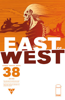
There are a bunch of Image series that have entered the 30-50 issue range, a new and welcomed trend for the Saga-led wave of creator-owned science fiction and fantasy books that have propelled the company in the past five years and allowed Image to cement itself as the go-to publisher for big name creator-owned projects. East of West might be the most consistent book of that bunch. Every time you think the series is bound to hit a lull, it jets in another direction entirely. Nick Dragotta’s art continues to impress. He has a handle on the wasteland motif, and his sharp lines precise technique make these issues feel longer than they actually are. Hickman is a master pacer. Few writers in any medium can pull over big concept science fiction like he can, and his masterful blend of alternate history with the classic sci-fi western concept covered in the urgency of a post-apocalyptic survival epic shines through on every issue. In so many ways, this book is the antidote to Saga. It’s both dense and vast. It’s not a series to jump into uninitiated, and the pacing can be confusing if not frustrating. Hickman cut his teeth with shorter sci-fi epics. It wasn’t really until he sank his teeth into the Fantastic Four that he allowed his high concept style to expand ad infinitum, and it wasn’t until he finished his Marvel epic at the conclusion of Secret Wars that a full clarity of his vision was possible. The major payoff for this series will come later. In the meantime, we are able to see Hickman’s best character work all while reveling in Dragotta’s panels.


Liam Sharp’s Brave and the Bold might have been the most beautiful comic of the year. Sharp’s intricate page designs included detailed Celtic rope work edges and layered panels caused me to stare intensely at each page. I’m a slow reader. I’ve always been that way. I think one of the reasons I started reading comics when I was younger was because I could get through them quickly and feel some sort of accomplishment. Well, thanks Liam Sharp, because I couldn’t quite blow through any of these issues because taking in each page required at least twice the time of most books. There are worse problems to have. This book was a welcomed treat coming on the heels of King’s successful Wonder Woman/Batman team up. Mythology has been mined six ways to Sunday by comic creators, so for Sharp to produce something so fresh says much not only about the source material – which is indeed novel compared to the typically adapted Greek, Roman, or Egyptian canon – but also about how well Sharp weaves it into his storyline


I fully acknowledge the sample size for Fearscape is a little light, but I don’t care. It is the best book on the stands right now. I’m not alone in this feeling, and it certainly deserves all of that praise. O’Sullivan’s narration is intentionally ham-fisted, a stylistic choice effective for both selling the intentionally melodramatic genre and the providing a healthy dose of satire. Fearscape descends from the world of Vertigo, with direct nods to The Sandman. It also recalls in both style and concept Fables and The Unwritten, as well as literary influences from British fantasy masters like Tolkien, Lewis, and Pullman. There’s the magical realism of Borges and Marquez along with the existentialism of Camus and Kafka and the mania of Poe.

16. East of West (Image Comics)
Jonathan Hickman – Writer
Nick Dragotta – Artist
Nick Dragotta – Artist
There are a bunch of Image series that have entered the 30-50 issue range, a new and welcomed trend for the Saga-led wave of creator-owned science fiction and fantasy books that have propelled the company in the past five years and allowed Image to cement itself as the go-to publisher for big name creator-owned projects. East of West might be the most consistent book of that bunch. Every time you think the series is bound to hit a lull, it jets in another direction entirely. Nick Dragotta’s art continues to impress. He has a handle on the wasteland motif, and his sharp lines precise technique make these issues feel longer than they actually are. Hickman is a master pacer. Few writers in any medium can pull over big concept science fiction like he can, and his masterful blend of alternate history with the classic sci-fi western concept covered in the urgency of a post-apocalyptic survival epic shines through on every issue. In so many ways, this book is the antidote to Saga. It’s both dense and vast. It’s not a series to jump into uninitiated, and the pacing can be confusing if not frustrating. Hickman cut his teeth with shorter sci-fi epics. It wasn’t really until he sank his teeth into the Fantastic Four that he allowed his high concept style to expand ad infinitum, and it wasn’t until he finished his Marvel epic at the conclusion of Secret Wars that a full clarity of his vision was possible. The major payoff for this series will come later. In the meantime, we are able to see Hickman’s best character work all while reveling in Dragotta’s panels.

15. Descender (Image Comics)
Jeff Lemire – Writer
Dustin Nguyen – Artist
Jeff Lemire – Writer
Dustin Nguyen – Artist
I was nervous about including multiple writers more than ones. I don’t feel that bad in this case because Lemire's body of work this year warrants even more inclusions than I provided on this list. Besides the Black Hammer books, Lemire wrapped Descender and Royal City, wrote a great tie-in for Metal, and started a new Sentry series. Descender, though, is a whole other world of creativity. Lemire and Nguyen are quite a pair on this series. Following the finale of The Rise of the Robots, Descender entered its final arc as Lemire and Nguyen worked to wrap the series. It remains one of the few books that feels equally beautiful both in visual form and narrative composition. Lemire and Nguyen have crafted a tale of gigantic scope, yet they make the story very incremental and personal.

14. Usagi Yojimbo (Dark Horse Comics)
Stan Sakai – Cartoonist

13. Giant Days (Boom Box!)
John Allison – Writer
Max Sarin w/ Liz Fleming and Julia Madrigal – Line Artists
Whitney Cogar – Color Artist
John Allison – Writer
Max Sarin w/ Liz Fleming and Julia Madrigal – Line Artists
Whitney Cogar – Color Artist
Oh the angst of college. I wish I had Giant Days when I was in high school so that I could have had an accurate depiction for what college life would be. As it stood. I only had the late high school rom-com, Can’t Hardly Wait, and I’ve been trying to recover since. I came to Giant Days late, and I tradewaited most of the series until the end of last year. I’ve gone back and read through some of the collections I own, and there is something about the narrative that flows so well in trade format. I can see this comic being a bookstore staple for years to come.
Giant Days has always been about the relationships that guide us through the tumultuous times in our lives. John Allison continues to build these dynamics with the help of Max Sarin’s storytelling flow. The great thing about this series at it reaches old age is how it continues to churn. There is no cresting here.
It also features some of the best cover work, especially 34’s Ed puzzle, and last week’s bendy straw solo cup nightmare.

12. Outpost Zero (Image/Skybound)
Sean Kelley McKeever – Writer
Alexandre Tefenkgi – Line Artist
Jean-Francois Beaulieu – Color Artist
Sean Kelley McKeever – Writer
Alexandre Tefenkgi – Line Artist
Jean-Francois Beaulieu – Color Artist
I’m surprised I don’t see this series getting more love. I’ve thoroughly enjoyed it. I feel like it flew under the radar because, if memory serves, it debuted the same week as the much-hyped sci-fi series, Relay. I also feel that the YA push might have dissuaded some readers. Nonetheless, there is plenty of time to jump on, and you certainly should. McKeever has a fairly intricate plot web that slowly develops and reveals itself to the reader. This book is part survival epic, part mystery, and part coming-of-age story. It’s both fun and funny without losing seriousness.
Alexandre Tefenkgi and Jean-Francois Beaulieu steal the show in this book, though. The duo works incredibly well together to create beautiful snow-driven landscapes contrasted with the future tech of the outpost. And McKeever knows what to do with those panels, pulling back text to let the art speak for itself. He eschews narration to allow dialogue and art to drive the story. It’s a master class in restraint but also trust.

11. Apollo (Self Made Hero)
Chris Baker and Matt Fitch – Writers
Mike Collins – Artist
Chris Baker and Matt Fitch – Writers
Mike Collins – Artist
Apollo was a lucky library find. My local library has been stocking more graphic novels recently, and I only managed to come across this one because it was featured in a new books display. Look, I thought First Man was kind of a muted bummer, if still informative and oddly compelling. Apollo is the perfect companion/antidote to First Man. I read very little non-fiction, and I tend to appreciate graphic non-fiction much more than its prose counterpart. What is superb about this book is its ability to make the mission the focus from a wide angle perspective. It’s pointed and engaging. I wasn’t familiar with Mike Collins before I read this book, but his art is beautiful. I can best describe it as cinematic pop art or perhaps retro-modern. It feels clean and defined but without a veneer to cover its humanity.

10. The Wicked and the Divine (Image)
Kieron Gillen – Writer
Jamie McElvie – Line Artist
Matthew Wilson – Color Artist
Clayton Cowles - Letterer
Jamie McElvie – Line Artist
Matthew Wilson – Color Artist
Clayton Cowles - Letterer
I had a resurgent interest in Wicked and Divine this year sparked by the fortuitous uncovering of a box of books from my move last summer that allowed me to catch up on the series to begin reading it in single issue form right around the beginning of the year. I feel that there are certain series that are often overlooked because they have been consistently strong for a long time. I can categorically say that the 2018 issues of W&D have been stellar because of the arc of the story. This year’s felt faster and tense as the series builds to its scheduled 2019 finale. Clayton Cowles received an Eisner nomination for best lettering, and it’s a well-deserved nod for his ability to jump between settings and styles.

9. The Brave and the Bold: Batman and Wonder Woman (DC Comics)
Liam Sharp – Writer, Line Artist
Romulo Fajardo, Jr. - Color Artist
Romulo Fajardo, Jr. - Color Artist
Liam Sharp’s Brave and the Bold might have been the most beautiful comic of the year. Sharp’s intricate page designs included detailed Celtic rope work edges and layered panels caused me to stare intensely at each page. I’m a slow reader. I’ve always been that way. I think one of the reasons I started reading comics when I was younger was because I could get through them quickly and feel some sort of accomplishment. Well, thanks Liam Sharp, because I couldn’t quite blow through any of these issues because taking in each page required at least twice the time of most books. There are worse problems to have. This book was a welcomed treat coming on the heels of King’s successful Wonder Woman/Batman team up. Mythology has been mined six ways to Sunday by comic creators, so for Sharp to produce something so fresh says much not only about the source material – which is indeed novel compared to the typically adapted Greek, Roman, or Egyptian canon – but also about how well Sharp weaves it into his storyline

8. Proxima Centauri (Image Comics)
Farel Dalrymple – Cartoonist
I can’t say that I’ve ever read anything like Proxima Centauri before. I followed “This Will All Hurt” during its webcomic iteration, and it always impressed me. However, Proxima Centauri is on a completely different level. It certainly builds on the style of “This Will All Hurt,” but it takes the experimentation even further. The stylistic shifts give the book its manic pacing as it moves between novel grids, uninked sections, and shifting color schemes all designed to impart a complex metaphor of adolescence. There’s angst, and then there’s whatever Dalrymple is able to channel into this work. It’s a bold mania, intentionally disjointed and bizarre because that’s what adolescence is, after all.

7. Black Panther (Marvel Comics)
Ta-Nehisi Coates – Writer
Daniel Acuna, Jen Bartel, Kev Walker – Artists
Joe Sabino - Letterer
Daniel Acuna, Jen Bartel, Kev Walker – Artists
Joe Sabino - Letterer
Black Panther’s most recent relaunch/renumbering was exactly what T’Challa needed to remain fresh and relevant during a year that saw his backstory mined harder than likely any other previous run. There’s always a danger, regardless of quality, of reaching the saturation point for a character whose rise has been fairly meteoric in mainstream culture over the past year.
I greatly admire what Coates has done with his comics work because he constantly challenges himself to break new ground. The Intergalactic Empire of Wakanda is both a brand new paradigm shattering concept and a hindsight no-brainer. Of course, it makes sense for Wakanda to expand into space, for both literal and metaphorical reasons.

6. Now (Fantagraphics)
Eric Reynolds - Editor
Eric Reynolds - Editor
Now is the book we have needed for a quite a long time. I don’t read nearly enough comics outside of the mainstream, and I often don’t know exactly where to look. Interestingly enough, December through February tends to be the time I spend reading alternative comics the most because I start rabidly consuming everything I find on year-end lists. But Now is as accessible as it is intricate. In niche literary properties, there can be a barrier to newbies, but Now functions without pretense. It just lays out the goods in short bursts so that a semi-uninitiated reader such as myself can digest with ease. The best thing about an anthology like Now is that you get to experience the various styles of different cartoonists. It’s a far different experience than any mainstream comic, superhero or not.
My favorite single story in Now is J.C. Menu’s manic black and white tale “S.O.S. Suitcases” from issue #4.

5. Mister Miracle (DC Comics)
Tom King – Writer
Mitch Gerads – Artist
Mitch Gerads – Artist
I hemmed and hawed about including this book on the list because I initially felt let down about the ending. But I loved this series for 11 issues. While I wasn’t originally satisfied by the final issue, it didn’t undermine the whole series. The day I came home with issue 12, I re-read the entire series before I opened the finale. Then I read #12 four different times. I moved back and forth between frustration and letdown. I read reviews online praising it. I read some reviews decrying it. I couldn’t quite make up my mind. I let it sit for a week. And when I came back to it, I looked at it differently. Finales are tough, especially ambiguous ones that don’t give us the answers we want. Memories of angry debates over The Sopranos finale flooded my mind. I made my peace with it. I had a bit of a revelation.
In the end, it’s all meta-fiction. None of this matters anyway, right? This is comics, and there is a revolving door or death, so we don’t exactly need a definitive end because someone is going to come around and change it anyway, either intentionally or unintentionally. Gerads casts himself and King as audience members, aghast at what is about to take place. I think that touch is intentional. There’s a reason Lee and DiDio are laughing; there’s a reason Nick and Jamie are wide-eyed; and there’s a reason the comedians are all on the edges of their seats. I think we all expected something stronger to finish, or something that would give some sort of direction for a set of characters we had bonded with over the course of a year. We all like to see how things fit, and I think that’s a particular affliction for DC fans. We seem to be a little more obsessed with continuity than our Marvel friends. Where did this series fit? What matters? Maybe nothing, and maybe that’s ok.

4. Wasted Space (Vault Comics)
Michael Moreci – Writer
Hayden Sherman – Line Artist
Jason Wordie – Color Artist
Jim Campbell - Letterer
Michael Moreci – Writer
Hayden Sherman – Line Artist
Jason Wordie – Color Artist
Jim Campbell - Letterer
If you’ve ever talked to me about Vault Comics, you know that I emphasize two main components of their repertoire. The first is the creative expression. I wholeheartedly believe Vault has some of the most original concepts in comics today. The second is design. Vault books look better than any other books on the stands. Wasted Space is emblematic of all great things Vault.
Michael Moreci has a knack for space opera and high science fiction. Early solicits of this series advertised it as a Philip K. Dick thrown into a blender with Preacher. And while it’s not quite that dark or as brutal as such a comparison would indicate, that characterization is good. I think, though, that Wasted Space is much more like an R-rated Space Balls. It’s a comedy that takes itself serious enough, or it’s a space opera that realizes it’s mostly a farce. It’s both a send-up and a love letter – profane and goofy, but also heartfelt and sincere.
Hayden Sherman and Jason Wordie are a great combination. There’s a certain amount of planned sloppiness, of almost deliberate blurriness that fully connotes the tone of this series. It’s a romp. It’s gritty. It can’t look too shiny, even though I feel Sherman could produce such a book if necessary. Wordie’s color palette is equally well-matched. Hues of otherworldly pastels contrast with dark shades of deep space. It’s what keeps series from being too dark, allowing it to remain funny and weird.

3. X-Men Red (Marvel Comics)
Tom Taylor – Writer
Mahmud Asrar – Line artist
Ive Svorcina – Color Artist
Cory Petit - Letterer
Mahmud Asrar – Line artist
Ive Svorcina – Color Artist
Cory Petit - Letterer
X-Men: Red is the best X-Men comic since Fraction left Uncanny, and that says something because I greatly enjoyed the runs by Gillen, Bendis, Lemire, and Aaron. Taylor seems to get these characters. It’s helpful that he penned Laura Kinney’s adventures in All-New Wolverine while creating Honey Badger/Gabby in the process. But that doesn’t explain how he knows how to write Jean Grey or Nightcrawler so well. He has a knack for team books and has always crafted dialogue that pops off the page without being endlessly wordy.
Taylor has also helped return X-Men to its roots, helping it function as an allegorical polemic against intolerance and hatred. Taylor wraps in current events with deftness and creativity so that his message doesn’t feel overly preachy or stilted. This is classic X-Men distilled through the lens of 2018. The book has a sort of emphasis of spirit, a momentum that reminds why I continue to prefer to read serialized comics.

2. Black Hammer: Age of Doom/The Quantum Age/Doctor Star and the Kingdom of Lost Tomorrows/Cthu-Louise (Dark Horse Comics)
Jeff Lemire – Writer
Wilfredo Torres, Emi Lennox, Rich Tomasso, Dean Ormston, Max Fiumara – Line Artists
Dave Stewart – Color Artists
Nate Piekos, Todd Klein - Letterers
Wilfredo Torres, Emi Lennox, Rich Tomasso, Dean Ormston, Max Fiumara – Line Artists
Dave Stewart – Color Artists
Nate Piekos, Todd Klein - Letterers
Black Hammer has evolved into its own version of a superhero universe. It’s weird, and it’s wild, and it’s pure Jeff Lemire. When it was first announced that Black Hammer would shift into a set of miniseries, I was a little nervous. I wondered if they’d maintain the same flow and cohesion as the original 13 issue series. I am happy to say that trepidation has long subsided. This year, we received four Black Hammer miniseries, further expanding the universe. Lemire’s epic is part Hellboy, part Watchmen, and part Locke and Key. Lemire’s work has the unmatched ability to be personal and deliberate, but Black Hammer is unlike anything else he’s done. It’s rich and expansive in ways that Lemire’s longer works like Sweet Tooth or Descender still don’t quite match because of their (mostly) linear progression. Dave Stewart deserves recognition as one of the best colorists working in comics today. His consistency allows for the books to feel linked despite the bevy of creators involved.

1. Fearscape (Vault Comics)
Matt O’Sullivan - Writer
Andrea Mutti – Line Artist
Vladimir Popov – Color Artist
Deron Bennett – Letterer
Matt O’Sullivan - Writer
Andrea Mutti – Line Artist
Vladimir Popov – Color Artist
Deron Bennett – Letterer
But please, don’t take these influences to mean Fearscape is in any way derivative (unless of course you believe Henry Henry and think almost everything is derivative which it could possibly be but I’m going to stop writing about all of that now because I’ve been following a lot of philosophers on Twitter recently and things could start to get real weird real quick).
No, Fearscape isn’t derivative. In fact, it’s one of the more original concepts in recent comics memory. In the initial press, O’Sullivan described Fearscape as his most layered work, and I couldn’t think of a better word. On its surface, Fearscape functions as an engaging tale of the rift between worlds and the personification of fears revitalized and extended by O’Sullivan’s literary conceit. At its core, though, Fearscape is a meditation on authorial intent, the notion of creation, and the meaning of language. I can safely say that Fearscape is the only comic this year (or maybe ever) that made me think about Derrida and Levi-Strauss, the only one that made me consider Beckett’s translations of his own works and the implications of authorial distance.
And that’s the beauty of Fearscape. It functions on multiple levels, all of which are enjoyable themselves, but that coalesce to form something incredibly innovative.
And then there’s Andrea Mutti and Vladimir Popov. Their teamup allows the tone of this book to succeed. O’Sullivan’s work would probably succeed fairly well as a prose novel, but it’s Mutti and Popov who make this book transcendent. Mutti’s work is simultaneously detailed and shadowy; it evokes both the dire tone of the book and the meta-narrative concept of shades or shells to define the characters. Popov’s colors have a watercolor vibe, and he allows the colors to wash over Mutti’s line without allows them to wash out her detail. It’s an exercise in hue and shade, and impressionistic world perfect for the Fearscape.
Deron Bennett’s lettering will likely earn him some award nominations next year. He captures O’Sullivan’s manic Henry Henry narration with the right amount of nervous energy, and he helps to sell the paranoia and the commentary on authorial intent with word balloon placement.
Fearscape provides things we either haven’t seen or have rarely seen in the world of comics. This series is deep, cerebral, and innovative. It’s literary in a way that comics can’t always be because of inherent stylistic constraints. It’s nearly impossible to create an unreliable narrator using sequential art, though this team pulls it off. I don’t recall many issues that open with a series of nine grid blank panels with a narrator breaking the fourth wall. I don’t have many issues with narration boxes intentionally plastered over dialogue. I don’t have many books in which the narration and the visual sequences fight against each other. Fearscape is unlike most books on the stands, and it truly is the best book of the year.


![Sweat and Soap [Ase to Sekken] by Kintetsu Yamada](https://blogger.googleusercontent.com/img/b/R29vZ2xl/AVvXsEgMnQltxjWqGS1_duhCp9Er1a0NbALuSFrqvjaV4_PjN_w67xCGghYt-l0qKyqTH7Ei7gbq_mxVq8aPAuOiyaArwAMLJWhpGmOYaARUBnwvjmv2-ZIe20m_zR5CvKnPdI6US_AuOnmi3gSX/w680/57525895-BA7E-4EF8-9FE4-89F9C164E1A4.jpeg)
