*Book of the week*

Relay # 1
(W) Zac Thompson
(A) Andy Clarke,
(C) Dan Brown & Jose Villarubia
(L) Charles Pritchett
(Story) Eric Bromberg, Zac Thompson, and Donny Cates
Published by Aftershock Comics
Relay is part Blade Runner, part Starship Troopers. Near-future dystopias are by no means new, and the recent
spike in their proliferation over the past decade certainly indicates a
generalized anxiety surrounding the environment and the worldwide political
right turn. Relay is a story conceived by recent Marvel phenom Donny Cates
alongside Eric Bromberg and series writer Zac Thompson.
Andy Clarke, who first came to my knowledge with the vastly
underrated 2009 R.E.B.E.L.S. series, brings the appropriate tone to this kind
of comic. Clarke cut his teeth at 2000 AD, and he channels that gritty house
style into this book. If you’re not too familiar with Clarke, who hasn’t
produced a ton, think of a tighter Frank Quitely. Clarke’s line art pops
with the colors of Dan Brown and Jose Villarubia. (I've seen mixed commentary online about who is the colorist, and the credits list both. There isn't a stark contrast, so it's hard to discern). Whomever does the color work lets Clarke’s shading carry through a watercolor-esque pallet.
The result is a look that evokes pop-art by way of 80s animation. It's both cinematic and minimalistic. (There's also a cool reference to pop artist Rene Magritte's famous work, The Son of Man, towards the end of the issue).
The narrative structure of this book is what drives it for
me. Thompson and Clarke seem to play well off one another, as Thompson lets the
art work as the primary method of storytelling. He isn’t an overly wordy
writer, and that is important for a book that needs to do a hefty amount of
world building in order to get the story started. Thompson pulls back from the
bigger action sequences and allows Clarke’s panels do the heavy lifting. He
avoids drowning in exposition, starting off with a little narration before
transitioning to a dialogue heavy approach to advance build the backstory while
the art advances the plot. And his dialogue is refreshingly sparse. This isn’t
Sorkin or Bendis. There aren’t grand soliloquies proclaiming character
motivations or recounting in-story history. Thomspon works by way of jabs, not
uppercuts. Charles Pritchett, the letterer, spreads his boxes out to promote a
solid flow and an appreciation of the art. His balloons are tight without being
jammed. As a result, the whole book feels tight.
Thomspon and Clarke pace this book incredibly well, and that’s the book’s biggest selling point. It feels like a much longer read than it is. The sequences ebb and flow. Everything is crisp, and the scenes deftly alternate tone. There are muted scenes, and there are bombastic ones, but both feel equally effortless.
Rating - A I'm in for this series based on both the art and the narrative of this first issue. It's simultaneously reminiscent and novel, and Clake's art is superb.
If you're curious about a deeper diver into Relay, our own James Kaplan put together a great analysis. My friend Zack also has a nice piece at his website, Batman's Bookcase.

Wasted Space # 3
(W) - Michael Moreci
(A) - Hayden Sherman
(C) - Jason Wordie
(L) - Jim Campbell
(Cvr) Marguerite Savauge
Published by Vault Comics
I've said ad infinitum that Vault Comics consistently produce the best looking comics on the stands. Their comics come with fresh ideas and strong line art, yes. But what I think separates Vault from the rest of the pack is twofold - color work and production. These books are well-designed, and I'm not necessarily sure who to credit specifically with that, but I'll start with the art director, Nathan Gooden, and the cover artists for this series, Marguerite Savauge and Hayden Sherman. Besides popping on the stands, the books feel nice. I get it. I'm a little old school. I'm a texture guy. I like tangible things. Not everyone else does, and that's fine.
To be fair, I've never read a Vault comic digitally, so I'm not entirely positive of print supremacy*, but I am confident enough to say that these books have that intangible quality that only tangible things provide. Vault's paper stock is one of my favorite aspects. It's a thicker matte stock that is just a little glossy. For a point of reference, it feels perhaps just thinner than Ed Piskor's X-Men books, but a tad thicker, and certainly glossier than the current DC paper rolled out with Catwoman # 1.
To be fair, I've never read a Vault comic digitally, so I'm not entirely positive of print supremacy*, but I am confident enough to say that these books have that intangible quality that only tangible things provide. Vault's paper stock is one of my favorite aspects. It's a thicker matte stock that is just a little glossy. For a point of reference, it feels perhaps just thinner than Ed Piskor's X-Men books, but a tad thicker, and certainly glossier than the current DC paper rolled out with Catwoman # 1.
And then there are the colorists. Remember how Malibu books looked different? Remember when Image started, and interior art started to resemble the quality of cover art? Vault books aren't necessarily that revolutionary, but they are just beautifully colored.The separations, the renderings, the use of color to evoke tone - Vault has some of the best colorists in the business working for them, and Jason Wordie is assuredly one of them. Wordie's vibrant palette coupled with Sherman's thick inks create beautiful separations and the perfect tone for a spaced out space opera.
At issue 3, it's hard to go into a ton of detail about my appreciation for plot development without spoiling early issues. I'm greatly enjoying this series, but I think it will be the type of run that sells better in trade, and I think it will read incredibly well in the collected format. Wasted Space is a treat for anyone who considers themselves a space opera sci-fi fan in any media format. It's the kind of series that is both an homage and a parody.
The selling point for most readers will be Moreci and Sherman's characterization. Sherman isn't subtle. He goes for elaborate and expressive facial renderings that propel the over-the-top tone of this book. Moreci plays the slow game, a hard task for a new series (that I think is limited, right?).
Rating - A- When a series gets going like this, it's a treat for fans.

Die! Die! Die! # 1
(W) - Robert Kirkman, Scott M. Gimple (plot)
(A) - Chris Burnham
(C) Nathan Fairbain
(L) - Rus Wooton
If you didn't already assume from the title, the cover, or Nathan Fairbairn's tweets, Die! Die! Die! is a violent comic book. The combination of Kirkman, Burnham, and Fairbairn are a good mix for such a book. It's almost as if there isn't a brake pedal for these three, and the result is over the top insanity as soon as you turn the first page. Rus Wooton, who has lettered plenty of Kirkman books in addition to a stretch of the Jonathan Hickman Fantastic Four run, is at the top of his game with Die! Die! Die!
Burnham works in a wide variety of panelling techniques, including the novel nine panel grid and the somewhat avant garde irregular ten panel page. He's a great artist, and I almost forgot the extent to which I missed his work until I read this issue. He possesses an effortless style that looks like it's partially a middle school kid creating his own comic book and part avant garde technician. He has a heavy British/2000 AD style, a format I've loved since I first discovered his art during Grant Morrison's Batman run. And then there's Fairbairn, who's bright, explosive colors are the icing on this book. The content of this book is dark and depressing, but Fairbairn's colors are intentionally radiant, drawing the stark contrast that sets up the satire for the series. If all you've seen of this book is the cover, consider than to be fairly indicative of the contents. The book is one of contrasts, and those contrasts come at the breakneck pace of a Guy Ritchie film.
There was a worthy amount of speculation when this book was announced only a day before it hit the shelves. Without advance previews or any solicitations, reviewers and other professionals began to posit different theories about the book. One of the big guesses is that Die! occupies a world when Hillary Clinton won the election. I'm not going to spoil anything by saying "not exactly." Nonetheless, Die! occupies a world that resembles our own with political corruption and moral bankruptcy turned up significantly. At the core of the Die! world is a new political order in which the game of governing is enabled by a new level of personal manipulation, topped off by an intricate assassination system. It's mafia business applied formally and literally to politics. And its also bonkers. Kirkman's twisted mind is on full display. As I mentioned above, there's no brake pedal for this series, and the book drips with over the top satire that recalls Kick-Ass, or a revved up version of Black Mask's Calexit.
Kirkman's manifesto is a nice read at the end of the issue. It's almost unnecessary; we all probably understand the motivation for a secret issue, but it's nice to read Kirkkman's account. I believe the creators are entirely earnest, that they were driven by a cool factor. What's cooler than a secret book? What turns the current model of advance solicits, internet comics journalism, and New York Times spoilers on its head more than a secret comic? The fact that this book debuted a week after the Batman 50 debacle is a nice dose of unintentional poignancy.
Rating - B+ I'm in for issue two, and like the over-the-top satire of this series, but I think the creators will need to find someone with a brake pedal if they want to sustain this series.
*Cover of the Week*
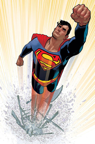
Superman # 1 by Adam Hughes
DC's naked (or, kinda close) variants are one of the best things the company has going now. I'm not sold on Bendis's vision for Superman, but I welcome any and all Adam Hughes interpretations of Kal-El. I love the dichotomy of this cover - the simplicity of the scene as Superman launches into the air contrasted with the intricacy of the shattered phone booth. This cover is an homage, I remember Hughes tweeting a while back, but I can't remember the original inspiration. Nonetheless, it's stunning, and it nearly lept off the shelves into my hands yesterday. It's be interesting to notice Hughes's style shift. He's work has become a little less painterly (if still evocative of a photorealistic-meets-oil painting technique), and his outline inks have become thicker and darker. I'm also on an Adam Hughes kick as I think his issue of Man of Steel (# 4) was the highlight of the series.
* I joke. I have 100% faith in the supremacy of paper.