

The two issues I look at below couldn't be more different. But they're both the work of talented writer-artists, and so each really reflects an artist's unified vision. Both look like the beginnings of excellent series.

Extremity #1
Created, Written and Illustrated by Daniel Warren Johnson
Colors by Mike Spicer
Letters by Rus Wooton
Published by Image Comics/Skybound
Created, Written and Illustrated by Daniel Warren Johnson
Colors by Mike Spicer
Letters by Rus Wooton
Published by Image Comics/Skybound
Extremity is a tale of tragedy, loss and revenge, and is one of the strongest, most ambitious debut comic issues that I have read in a while. It covers a lot of ground and it does so quite successfully, and unlike most single issue comics these days, Extremity is a
satisfying and complete story in its own right. It's about loss and pain
and purpose and the limits of revenge, and even over the course of a
single issue we come to care for the characters and get a sense of who
they are as people. Writer–artist Daniel Warren Johnson is someone with whom I was not familiar, but reading this issue makes me want to seek out his earlier work.
There's a lot of world-building for a single issue of a comic. The story focuses on one clan of (what appear to be) humans known as the Roto, whose enemy the Paznina attacked them years before, killing many, including the mother of Thea and Rollo, whose father Jerome is the leader of the Roto. They also brutally chopped off Thea's right hand, a particularly cruel act given that Thea was the most talented artist among the Roto. The majority of the first issue is focused on the counterattack by the Roto on the Paznina years later, and the ultimate bloody revenge achieved by the Roto and by Thea in particular.There's world-building going on, but it's more character focused and less focused on making sure the reader understands all aspects of this world.
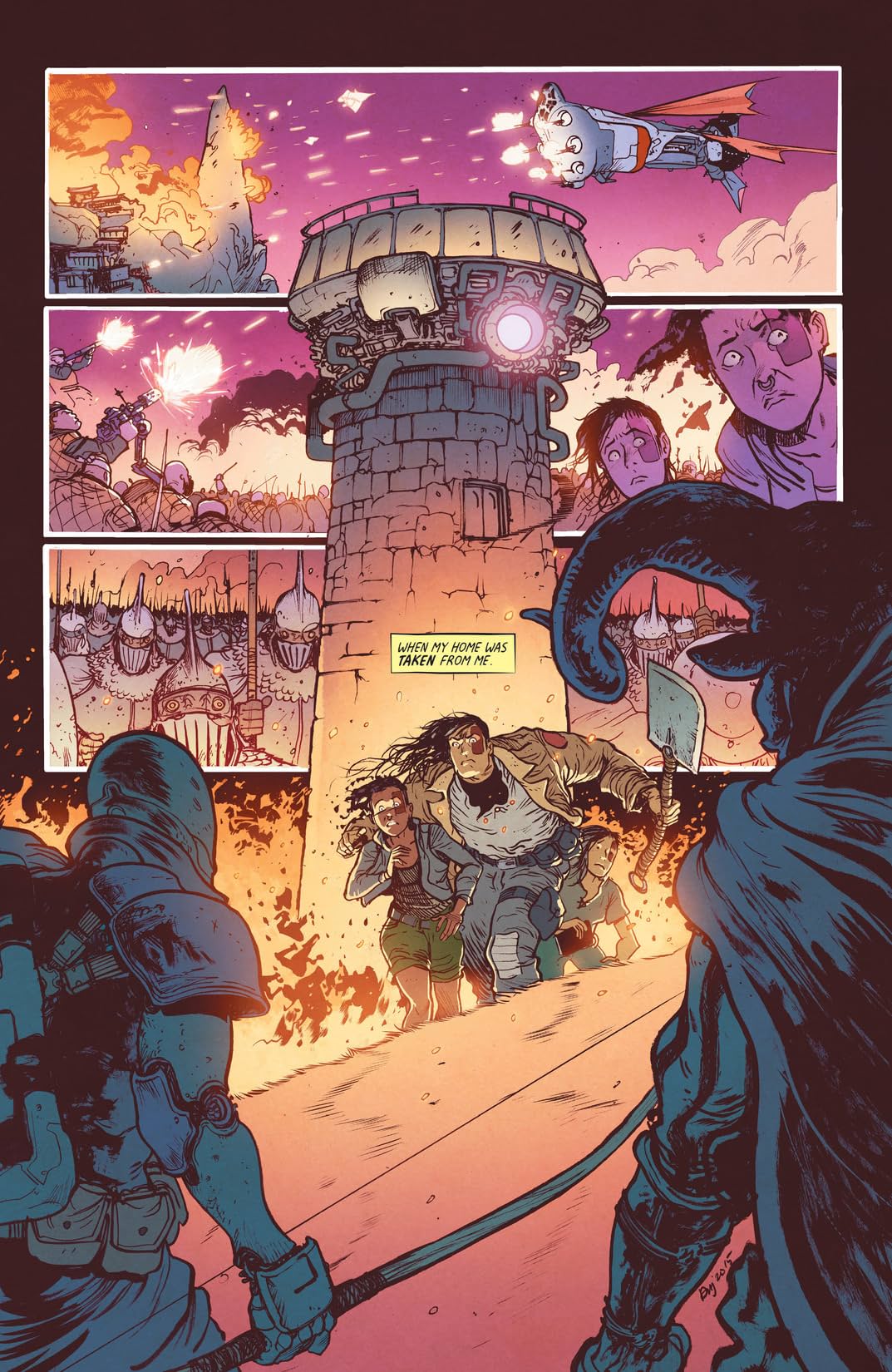
Johnson does fantastic, intricate, detailed, imaginative work in this first issue. It's an action-packed, visceral comic, not for the faint of heart. The art in this comic brings to mind Mad Max: Fury Road (both for some of specific costuming and for the relentless pacing). In the kinetic style and constant forward motion of the action, it feels like Johnson has a strong manga influence, and I'm reminded a little bit of other highly talented visual, visceral artists such as Raphael Grampá, James Stokoe and Felipe Sobreiro. There's a lot of really interesting, original and striking design in this issue, from the battering ram warship to the frightening mask that Jerome wears into battle, to the tattoos (paint?) on the characters' faces. It's sort of a mix of floating medieval times meets biker gangs meets post apocalyptic. It's all very engaging and highly detailed.
Johnson has a terrific artistic partner in colorist Mike Spicer. Spicer is an excellent, versatile colorist (whose work I've really enjoyed in books like Black Science and Head Lopper) and he really helps bring Johnson's illustrations to life. From the warm hearth of Thea's old home, to the gray industrial feel of the warship, Spicer's colors really pop and add a lot of richness to the story. This comic also has some of the very best sound effects lettering that I've seen in a very long time. It's big and bold and really feels like part of the art. Speaking of lettering, Rus Wooton does his usual excellent professional work in lettering the comic with a slightly more analog, hand drawn style.
As you can probably tell, I highly recommend you pick up Extremity. It's a great, promising debut with a lot to offer.

Royal City #1
Created, Written and Illustrated by Jeff Lemire
Letters by Steve Wands
Published by Image Comics
I just finished telling you what a great first issue Extremity was; that was a comic that succeeded in part because it was relentless, non-stop action and violence over the course of 24 pages. Well, what's wonderful about comics is that there are so many ways to successfully tell a story. Royal City is a completely different, but equally successful first issue. Writer-artist Jeff Lemire returns to the world of a family-based, ostensibly realistic piece of fiction such as his early (and much-loved) series Essex County. Royal City is an emotional, sprawling and spacious first issue that gives every character and every moment a chance to breathe, as members of family are brought together as a result of a family emergency.
The feeling I got reading Royal City was that it reminded me of an excellent TV drama, that deliberately (this is a well-paced issue) introduces the disparate characters, coming together for a purpose. In this case, the family patriarch Peter Pike has suffered a stroke, and we see this affecting his wife Patti and their children. There's Tara, the real estate broker and budding entrepreneur whose plans for the Royal City Manufacturing plant don't line up with the wishes of her family or the town itself. There's Pat, the novelist who's hit something of a dead end on his current project. There's Richie, who's less interested in working at the Royal City Manufacturing plant and more interested in drinking himself into oblivion. And there's Tommy, who - well, I don't want to say too much about Tommy. As I've discussed previously, Lemire is someone who's interested in exploring themes of loneliness and alienation; people for who the world as it is doesn't quite fit. I'm glad that Lemire has chosen to tell this as an episodic story; this expansive, oversized first issue* gives him a real chance to introduce the main cast of characters and start to explore those themes of loneliness and feeling adrift.
The feeling I got reading Royal City was that it reminded me of an excellent TV drama, that deliberately (this is a well-paced issue) introduces the disparate characters, coming together for a purpose. In this case, the family patriarch Peter Pike has suffered a stroke, and we see this affecting his wife Patti and their children. There's Tara, the real estate broker and budding entrepreneur whose plans for the Royal City Manufacturing plant don't line up with the wishes of her family or the town itself. There's Pat, the novelist who's hit something of a dead end on his current project. There's Richie, who's less interested in working at the Royal City Manufacturing plant and more interested in drinking himself into oblivion. And there's Tommy, who - well, I don't want to say too much about Tommy. As I've discussed previously, Lemire is someone who's interested in exploring themes of loneliness and alienation; people for who the world as it is doesn't quite fit. I'm glad that Lemire has chosen to tell this as an episodic story; this expansive, oversized first issue* gives him a real chance to introduce the main cast of characters and start to explore those themes of loneliness and feeling adrift.

Lemire is second to none as a sequential storyteller, and all that skill is on display here. He's got a unique visual style that reveals fundamental truths about human emotion in a way that a more traditional artistic style doesn't necessarily accomplish. I also think Royal City has some of Lemire's best, most accessible artwork. His work can venture into the realm of trippy and dreamlike (such as in works like Trillium, The Underwater Welder or After Death), which perfectly suits those stories. However, in Royal City, Lemire is using a slightly more conventional panel layout and his characters feel slightly more realistic in their design. Lemire still brings his unique, distinctive, angular style to Royal City. I'm a huge fan of his art style and while I think he's justly praised for his beautiful, hauntng and sad work, I think he might be underappreciated when it comes to facial acting and body language. There are a lot of great, small moments of personal interaction in Royal City and Lemire does terrific, precise work in portraying emotion through facial expression, whether it's the turn of a head, the crook of an eyebrow, or someone's posture.
Lemire also does a terrific job in establishing a sense of place for the characters. Royal City (the place) really comes to life as a small town (with a name seems that like a vast overstatement, a nice little joke) whose best days are behind it, and Lemire does a great job showing us the specific, industrial architecture and geography of this place. I'm also impressed with Lemire's coloring choices in Royal City. It's would have been easy and more obvious to choose gray, washed out colors and make this a gloomy-looking book. But instead of that, Lemire chooses a warmer, prettier color palate but gives them a somewhat faded look. Very much a metaphor for the town and the people in it; maybe their best days are fading, but they seem like people doing the best they can with their lives; people are still living and loving and working and struggling.
Royal City is a relatable, fundamentally human story which looks like it should have some fascinating twists, and I highly recommend it.
* I'm a huge fan of the oversized first issue by the way, I think is a great way to start off your story and to make a first issue more than just a preview of the series.


