Dark Horse Presents #4
Semiautomagic Chapter 1 by Alex de Campi (words), Jerry Ordway (line art), and Marissa Louise (color art)
Dream Gang Chapter 4 by Brendan McCarthy
Wrestling with Demons Chapter 4 by Jimmy Palmiotti and Justin Gray (words), Andy Kuhn (line art) and John Rauch (color art)
The Chaining Chapter 2 by Tyler Jenkins (words and line art) and Kelly Fitzpatrick (color art)
The Mighty Chapter 1 by Keith Champagne (words and inks), Leonard Kirk (pencil art), and John Kalisz (color art)
House of Fun by Evan Dorkin (words and line art) and Sarah Dyer (color art)
Published by Dark Horse Comics
The fourth issue of the newly revamped Dark Horse Presents (which has a 200th issue special coming up, even though the numbering has changed several times now) was extremely strong this time, helped by the addition of a new story from Alex de Campi and Jerry Ordway along with a closing number by Evan Dorkin that shows his razor sharp wit and total disdain for all humanity haven't lost a step.
While it's been a bit disconcerting that some stories are "to be continued elsewhere," something I don't really care for, I am happy to see things in full swing at this point, with some stories starting, others continuing, and one-shots like the Dorkin special. I hope that this time around, there's a greater focus on Dark Horse Presents as its own thing, not as a way to put together just enough material to release a one shot, as happened far too often in Volume 2--to the point that I gave up reading because I knew inevitably, there'd be a floppy collecting the ones I was most interested in.
I'd been eagerly awaiting seeing Alex work with Ordway ever since I'd heard about their collaboration and it doesn't disappoint. In just 8 pages, the pair create an entire magical world, letting you know that while it's set in a familiar place, something about the Yale we know has changed. Little touches like the extra eyes on a character or the fact that a cop isn't shocked when the main character begins drawing magical symbols on a comatose boy do more to set the stage than endless exposition.
Instead, de Campi can focus on the main character's internal struggles with what is going on. She's doubtful that things can change, and when a time-lost friend returns to warn her of danger, it sets the questions at the back of her mind in full gear--and leaves the reader eager to find out what happens next in chapter two.
This is a very tightly plotted piece, with no page space wasted. Ordway's ability to tell a story from back when a comic didn't need six issues to tell only two issues worth of information serves him well here, as he's able to depict exactly what Alex needs for her dialogue and narrative balloons. He goes from bored college kids inside a classroom to a typical New England suburb to displays of magical power without missing a beat. So many little touches (like cracks in the drywall of the house) or the flash of a concerned eye really take this story to another level.
With a great premise and two outstanding creators on the job, this looks to be a highlight of the next few months.
 |
| McCarthy's cover to Issue 3 shows off his amazing visuals in Dream Gang. |
Dream Gang reminds me a lot of something you'd find in 2000 AD, and I look forward to seeing its return at a later date.
Instead of spending a lot of time showing the demonic fights, which would have been a great use of Andy Kuhn's skills, we're moving forward rapidly in time in Palmiotti and Gray's Wrestling with Demons. Our hero has persevered, so now he saves his daughter--except that the rules of the game changed, because it's a demon setting the playing field. There's nothing new going on here, but it is a lot of fun to see Kuhn's illustrations. I just wish he'd gotten to do more of that and less of the human grit and determination sections.
After the second part of The Chaining, which I'm afraid isn't catching on with me, there's a new story involving Bat-scribe Peter Tomasi's The Mighty, which looks a lot like the main hero isn't quite as heroic as he presents himself. A skeptical cop has to keep him in line, no small task. I like Kirk's art here a lot, and the script is okay, but I'm not sure I need another anti-hero hero story in my life. We'll see where this goes.
 |
| So true, Dorkin. So true. |
But the best of these is where a fan of the Dark Knight indicates he's willing to risk anthrax if that's what it takes to read about Bruce Wayne. It's that level of over-the-top, yell-at-the-reader style that makes Dorkin so entertaining. He'll exaggerate out as far as possible to make his point.
These strips are all small and tightly constructed, with a lot of close-up work and emphasis on the gag or the character design. We don't see a lot of detail, because it's a newspaper strip not a full page. Dorkin's able to show us just enough to nail each gag, and honestly, almost all of them are pretty damned good, something that's hard for anyone who works in parody comics to manage. I came away impressed and I hope Dorkin is able to do more comics work in 2015. He's seriously under-appreciated.
I'm a fan of anthologies, so it's easy for me to say "Go Read Dark Horse Presents." But honestly? Go read Dark Horse Presents, especially this month's issue. It's solid stuff, and I look forward to more.
Punk Mambo 0
Written by Peter Milligan
Line Art by Robert Gill
Color Art by Jose Villarrubia
Published by Valiant Entertainment
Living in the unlikely location of the Louisiana Bayou, Punk Mambo lurks among the dangerous swamps, using her connection to the punk scene to conjure up her magics. When she's given a vision of those who wronged her, she's off to seek revenge in London as this one-shot provides an origin for a character lots of people--including me--took an immediate liking to in the pages of Shadowman.
The idea of a British punk-rock kid who looks to Sid for inspiration--he's comically unhelpful--hanging out in Louisiana and still rocking her Mohawk while using voodoo dolls and accepting sacrifices from the locals is one of those things that's either going to appeal to you or turn you away. Milligan is clearly having some fun at John Constantine's expense here, especially as the story progresses and we find an aging magic user--who once tortured Mambo (nee Victoria) and others to sap their strength to grow his powers--trying to hang on in a world that no longer needs him. It's a bit of nose-tweaking to be sure, but Milligan mixes it in with so many other ideas and concepts--almost too many--that he can be forgiven. Mambo has her own story, and she's front and center here, confronting her past demons and finding out that sometimes it's better to just move on with your life and understand that going back to deal with those who hurt you isn't worth it.
Robert Gill's art style is far more realistic and straightforward than Roberto de la Torre, but he's still able to handle the magical elements well, giving them a sense of mystery and blurring the lines a bit when the story calls for it. Shifting from swamps to city and across time periods isn't easy, but there's a definite consistency, aided by Villarrubia's color work, which allows things to be dark without some of the obscuring issues we had in her original appearances. When the time comes for the creepy shit, Gill delivers, especially when we see the Constantine stand-in practicing his magics.
It's great to see Valiant branching out a bit like this to bring more female characters into its main rotation, which, given its 1990s origins, is a bit dude-heavy, as much as I enjoy many of the books. I'd happily read more of Mambo's adventures, which probably need to be solo, as I'm not sure how her talents would mesh on a team book. Regardless, fans of magical characters definitely should give this one a look.
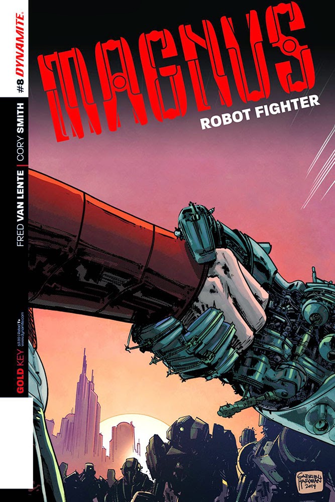
Magnus Robot Fighter 8
Written by Fred Van Lente
Line Art by Cory Smith and Felipe Cunha
Color Art by Mauricio Wallace
Published by Dynamite Entertainment
What happens when all you were fighting for turns out to be something you didn't realize? You get a really jaded main character. I was iffy on this one after the first issue and the zero issue, but since I generally like Van Lente's work, I decided to go back and catch up to this point. Unfortunately, this still feels like a miss to me. Magnus's power levels are such that it's hard to believe he's ever in real danger, the idea of constant replication makes it feel like the whole thing's a video game, and the punchline--that Magnus was deceived for a greater purpose--just doesn't resonate for me at all.
When Magnus is laughing bitterly, I'm sharing his disappointment--and not in a good way. I understand nothing in comics is real, but I need something to ground me in a serious story like this one. I still feel adrift nine total issues later. The art team does a great job with the look of the book and the creation of the world, but it's not enough to keep me going. This one sets up a new jumping on point, but it's a jump off point for me, and I can't recommend trying it.
Sinergy 1
Written by Michael Avon Oeming and Taki Soma
Line Art by Michael Avon Oeming (main story) and Taki Soma (backup)
Color Art by Taki Soma
Published by Image Comics
They say sex changes a person, but it's never been quite so literal as when a girl loses her virginity and starts seeing monsters in this first issue that's visually innovative but features a flat story.
If you're going to do a book about a few select people who can see monsters where others can't, perhaps setting in in freaking Portland, Oregon isn't the best idea in the world. Effectively, this comes off as "What if Grimm were about fighting demons instead of fairy tales and legends?" and while that's not a bad premise, placing it in the same exact place as the extremely good television show means that if you aren't also note perfect, you're going to suffer by comparison.
That's exactly what happens here. The idea of sexual activity activating special senses is okay as far as it goes (after all, mutants in Marvel's world tended to get powers as they hit puberty*) but everything feels so ham-fisted. Dad bursts in while his daughter is having sex, for example. The girl has to come to terms with a new worldview, and that her father is a killer. (But don't worry, as we're told in a horrible piece of dialogue, "See, you're not all soul-sucking monsters. Fry's on our side!", he only kills demons that deserve it--another pale echo of Grimm.) The demons are gathering to fight against humanity.
If you think you've heard this all before, it's because you have. Now, I'm the last person to argue that things must be original. Heck, I just praised Punk Mambo for making allusions to Constantine. But if you're not going to be innovative, you need to at least use the tropes you're handling well. Neither Oeming or Soma convince me they're able to handle this copycat of one of my favorite television shows properly. While I give it a lot of points for having amazing color work (garish orange hair, green backgrounds, purple used as a featured shading for non-purple items, like a hockey stick) and trying to give the teen girl some agency, that's not enough to save this one. Unless you must have your dose of Oeming's blocky art style or are desperate for more Portland-based comics, this one is a pass.
That's it for this week! What did you read that you liked?
*Is that still true? I have no idea what's going on in the mutant world these days.


![Sweat and Soap [Ase to Sekken] by Kintetsu Yamada](https://blogger.googleusercontent.com/img/b/R29vZ2xl/AVvXsEgMnQltxjWqGS1_duhCp9Er1a0NbALuSFrqvjaV4_PjN_w67xCGghYt-l0qKyqTH7Ei7gbq_mxVq8aPAuOiyaArwAMLJWhpGmOYaARUBnwvjmv2-ZIe20m_zR5CvKnPdI6US_AuOnmi3gSX/w680/57525895-BA7E-4EF8-9FE4-89F9C164E1A4.jpeg)

