


Edited by Damon Keen and Amie Maxwell
Published by 3 Bad Monkeys
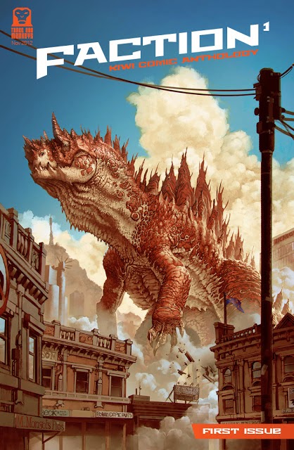
A group of varied creators from New Zealand show their skills in this first in a series of high-quality anthologies. Ranging from silent dark comedy to high fantasy to the obligatory stoner short, Faction shows that there's a ton of talent in New Zealand making comics that haven't yet hit the US scene.
Given my desire to keep finding comics from other countries, especially those that fit the mini-comics aesthetic, Faction was a no-brainer for me, and I had it on my radar to check out even before editor Damon Keen and contributor Tim Gibson contacted me about reviewing the series for Panel Patter.
From the opening story, Ned Wenlock's Migrane, which features a pair of twins that look a bit like South Park's Terrance and Phillip and their desire to keep the family peace despite total dysfunction to Roger Langridge's closing one-pager that shows off his patented playful torture of rhyme scheme as he relates a nautical misadventure, the overall quality of Faction really impressed me. Even the weaker entries for me personally (and every reader will have their own opinions on which stories in an anthology are best/worst) showed craft and care. It's a real tribute to editors Keen and Maxwell that when you are flipping through Faction 1, there's not a single time when you think, "How did this get in here?"
 |
| Art from Damon Keen |
My favorite story was definitely Keen's One Giant Leap, which features an astronaut who gets trapped in the void of space with only minutes to live when a line snaps. He forms a desperate plan, cleverly illustrated by a diagram panel, and enacts it--but success under such circumstances is rare, and Keen's rug-pulling ending is the perfect capstone to the short. His work has a bit of a Mignola feel, with dark shading and angular lines. Completely wordless save a few visual "words," it's easy to follow along and watch the man as he fights for life, even as we can't help but laugh a bit at his misfortune. Great stuff!
 |
| Art from Jonathan King |
- Jonathan King's Bookish, in which a detective must try to figure out why victims seem drained of their entire lives, leading to a a very different kind of vampire. Paced quickly enough for the short space, but there's a nice punch and an ending that gives the reader plenty to think about. King uses a ton of small panels to pack as much action as possible, and his illustrations of the setting do just enough to build the world while letting the characters drive the story.
- Zion//Eye from Czepta has a look inspired by manga/anime, with wide-eyed characters and bright coloring combining with lush, dense backgrounds setting the tale in a fantasy jungle. It's a parable about patience, using the mentor/mentee relationship quite well. Youthful exuberance turns to leaning, as the reader and the protagonist learn the nature of the world around them.
- Matt Emery's Do You Want To Talk About it, where a man risks life and limb to save a girl, in a world that becomes increasingly destructive, only to find out that's not even close to his actual reality. That revelation takes things from enjoyable to thought-provoking, as the character sits awake, wondering why his dream partner isn't the same as his one in the waking world. The mostly black and white work features medium looks that allow us to see how small the man is in relation to the world and the threats in it, and there's no indication of the fact that it's fake until we need that information.
 |
| Art from Matt Emery |
I should note that Tim Gibson's Moth City entry is a teaser poster, which is cheating a bit, but it's fun to see a creator take on a movie poster to promote his work, which I have reviewed here in the past. We get more from Gibson in a later installment of Faction, so it's okay to only get a splash page here.
Faction 1 is what all anthologies should strive to be--well edited, varied, and always putting its best foot forward. This thing has amazing production values from start to finish, and is well worth purchasing in hard copy, though if you are unable to do so, you can actually just download a free PDF of the issue. While the hard copy is gorgeous and the best way to read the series (and I rarely say that), the digital copy keeps the integrity of the coloring just fine, which was a big part of the appeal for me.
For anyone who likes finding new creators to follow or wants to see what the world of comics has to offer or, heck, just likes good short comic fiction, Faction 1 is going to be for you, and is well worth grabbing.
![Sweat and Soap [Ase to Sekken] by Kintetsu Yamada](https://blogger.googleusercontent.com/img/b/R29vZ2xl/AVvXsEgMnQltxjWqGS1_duhCp9Er1a0NbALuSFrqvjaV4_PjN_w67xCGghYt-l0qKyqTH7Ei7gbq_mxVq8aPAuOiyaArwAMLJWhpGmOYaARUBnwvjmv2-ZIe20m_zR5CvKnPdI6US_AuOnmi3gSX/w680/57525895-BA7E-4EF8-9FE4-89F9C164E1A4.jpeg)


