


Teenage Mutant Ninja Turtles 30
Story by Kevin Eastman, Bobby Curnow, and Tom Waltz
Written by Tom Waltz
Illustrated by Sophie Campbell and Ronda Pattison
IDW
Michelangelo may be a party dude, but he's also keenly aware of the problems facing the Turtles in this subdued issue that focuses squarely on the characters.
This series just keeps getting better and better. The idea of Mike looking at what's going on is perfect, because his perspective isn't as heavy-handed as any of the other Turtles, which means its unvarnished. Using his letter to their friend back home to set up the scenes works incredibly well, allowing Waltz to build from there.
An issue like this one is hard to hold together with so much going on, but Sophie Campbell and Ronda Pattison are up to the job. From the opening scenes, where Mike goes from earnest to curious as he hits on how to phrase the letter, to the final tender moment of the Turtles together as a family along with Alopex, the entire issue strikes a balance between concern, fear, and caring. It's a fragile peace that's about to be disturbed, and we see that in the eyes of these humanoid characters as they stare at each other and out at the reader. Despite much of it taking place at night, Pattison keeps things just clear enough for the reader to catch the little details Campbell puts in every panel.
The strongest part of the issue, though, is the expression of Leo's personal demons. First Campbell goes for horror as the trees themselves encircle and menace the Turtles' former field leader, who is seen from an angle instead of head-on. Then just as he's about to fall prey to bloodlust, we shift to his vision of his mother. Campbell softens her lines and flattens out the art a bit to give it a fresh, almost mural-like look while Pattison turns pastel with the coloring, to set it apart from the dark reality of Leo's actual world. When we return to the present, it's a very different Leo, one who is finally ready to begin healing, and we know this not from the text but from the look Campbell gives him, reaching out an arm and widening his eyes, baby-like.
TMNT has been one of my favorite comics since I started reading it about two years ago, and it hasn't lost a step. This isn't just good licensed comic work--it's great comics, period.

Adventure Time 2014 Winter Special
Written and Illustrated by Luke Pearson, Jeremy Sorese, T. Zysk, JAnet Rose, and Allison Strejlau
Boom! Studios
A series of stories set in Wintertime unfortunately left me cold as the creators weren't able to manage the level of insanity and fun needed to make Adventure Time sing on the printed page.
The first story, Snow Hope, finds Finn and Jake ganging up on the Ice King without a good reason, then Finn being captured by a sinister force within his wooly jumper. There's nothing really silly going on, there are almost no jokes, and the resolution is far to straightforward to work within this world. Pearson doesn't seem to understand that these characters need more than just action to make them work, and it's not helped by his inability to vary the style and shape of the panels. Everything is a straight-on shot of the action within a twelve panel grid, and he never takes advantage of Jake's shape-shifting powers. There's just no fun in this one, and that's a big part of Adventure Time's appeal.
Pups in Persil from Sorese takes Finn out of the picture and only uses Jake for a cameo, focusing instead on BMO, which means that there's not a lot to do except watch the portable video game system ride the back of Tree Trunks while escaping from ice cats and trying to release a fire dog. The lack of strict panel work is interesting as the reader must follow the action of the characters and Sorese leads the eye across the page with a clever use of a long and winding path. But in the end, the jokes and insanity aren't here, making for a cute but dull story.
The Earl of Lemongrab is a peculiar choice for a feature, and this one, too, just doesn't bring anything, as Finn and Princess Bubblgum only show up for a closing remark on how grumpy he is. Turns out a humanoid lemon doesn't care for Winter. Who knew? T. Zysk just wasn't able to get me interested in this one at all.
Janet Rose and Allison Strejlau finish things out with the best feature, with the gang hanging out in an igloo that gets zapped by fire, then attacked by a horrible--but delicious--monster. The characters talk more on model here, with Jake morphing to save the day ("I got this!") then realizing even his stretching powers aren't enough ("I don't got this!"), the kind of playful words and visuals that the other stories lacked. Characters flow and morph in Strejlau's depictions, and we get cool concepts like Finn whipping snowballs at the creature while Jake forms himself into a living supply chain of white projectiles. In the end, it's all a misunderstanding because the beast is merely sad because he's a baking failure.
Unfortunately, one story's not enough to recommend this one. Better to stick with the main series and the mini written by Tobin and Coover.

Never Ending 3
Written by Adam P. Knave and DJ Kirbride
Illustrated by Robert Love, Felix Perez, and Heather Breckel
Published by Dark Horse Comics
Charlie barely has time to deal with his lack of powers when a crisis hits that proves how selfish he's been as this look at the nature of being a neigh-immortal superhero comes to a philosophical close.
Working again between past and present, Knave and Kirkbride finish off the duel between Archie and Charlie with a fascinating use of the former's obsession to redeem the self-loathing sins of the latter. I don't want to give away too much here, but I really like how Charlie, who sees the mistake in his denial of his gift, takes the lead in doing his part to make up for it so that no one else might pay for his own sins.
Does he succeed? That's left up to the reader in a purposefully ambiguous ending.
What's less ambiguous is that Love's art works best when he's doing the inking. Combined with Perez, the unique, Erik Larsen-like look is rounded out and exposes the flaws in anatomy that work when the inks are flatter. The layouts are still strong, but they lack the exaggeration that made them distinctive in the first two issues. They carry a nice sense of emotion but overall, it's just not a good match, at least to my eyes. Breckel's colors are vivid and bright, however, allowing the linework to shine through and still keeping the shades bright and distinctive.
Never Ending was a very good mini-series that explored an aspect of super heroism and what happens when a normal guy has the weight of the world on his undying shoulders. It was just the right length and I'd love to see more of these self-contained pieces from the writing team of Knave and Kirkbride.
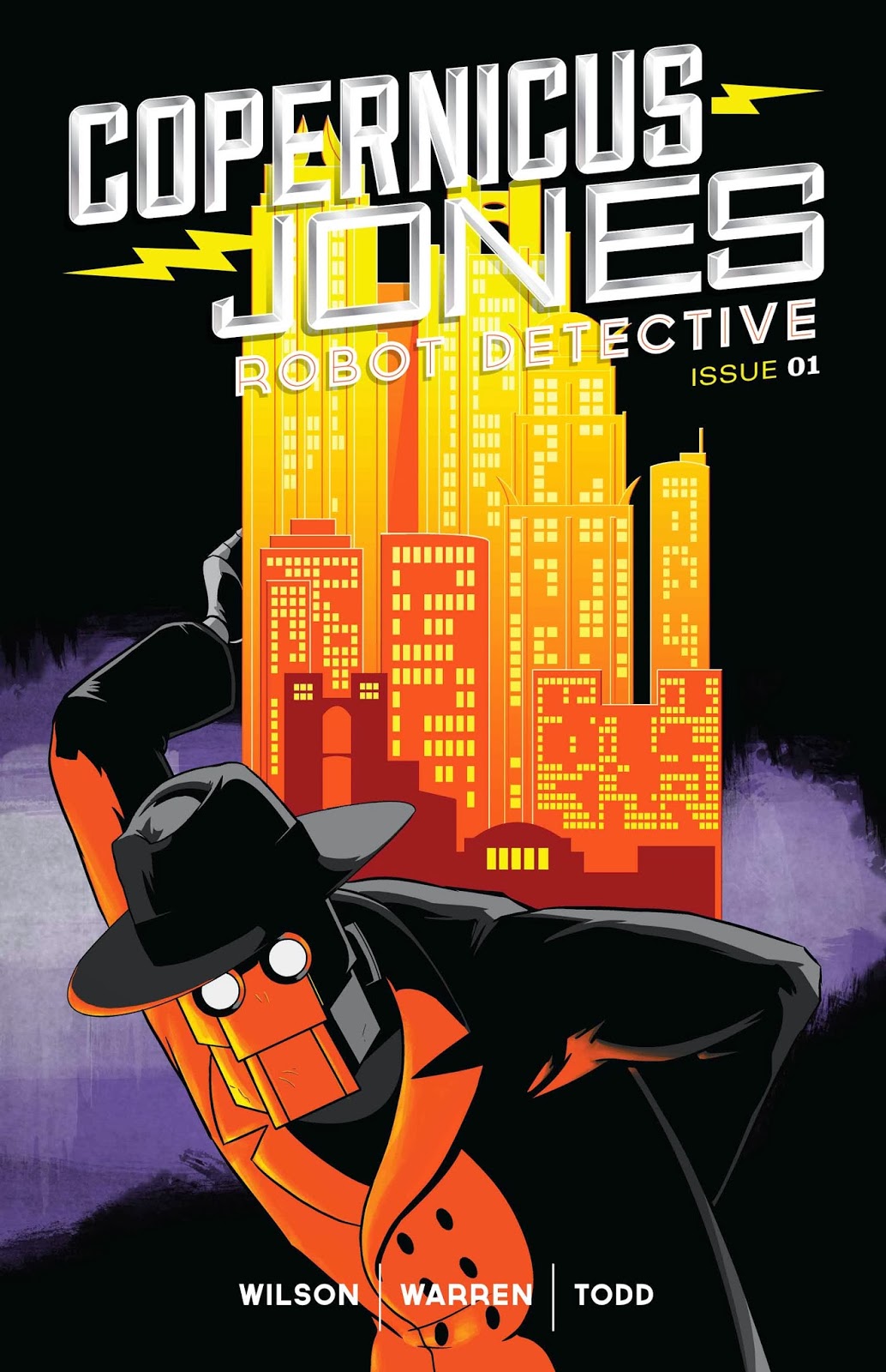
Copernicus Jones Robot Detective 1
Written by Matt D. Wilson
Illustrated by Kevin Warren
Published by Monkeybrain
This one is exactly what it says: A noir story, drawn in grey tones, featuring robots mixed in with the femme fatales, bookies, schemers, and the mob. How much you enjoy it is going to be entirely based on how you feel about the premise.
The story itself is pretty standard noir stuff. A private detective of grey morality takes on a too good to be true case in order to cover his bets and then some. He gets mixed into a mess with the mob, who want to fit him for magnetic overshoes as the caper takes on several sinister turns.
I love old crime fiction, so I had a lot of fun seeing it adapted for the inclusion of bots. Wilson isn't afraid to call them out (like having a bottle of oil instead of whiskey in the desk) and Warren is good with the little touches, like denting Jones' face in the impression of brass knuckles. Plus, we get a robot in a trenchcoat and a fedora. Really hard to go wrong with that. Warren's style is similar to Scott Wegna, but with a bit of a sharper edge, and I admit that the Robo thing is probably why I drew a parallel.
The plot is fast-paced with a lot of action, and the only problem so far is that it's not exactly doing anything new with the tools of a noir story, save for including robots. I hope to see some more as we move along, because the premise is fun but it needs more to hold up against the tons of other things out there to read with cool concepts and a way to make the story more varied.

Furious 1
Written by Bryan JL Glass
Illustrated by Victor Santos
Published by Dark Horse Comics
A woman with superpowers and a touch of anger finds setting the message almost impossible in another story taking on the difficult task of finding a way to deconstruct the genre that hasn't been done before.
I'm not one of those who thinks that Watchmen ended the ability of anyone to discuss superheroes from a critical perspective, but I have seen it go horribly wrong. You have to find just the right angle and be careful not to just make it a depressing, morose mess.
Thanks to crisp, engaging dialogue, starting the story in the middle and working around the subject, and nailing the fact that the media would go extra hard on a violent female hero, Glass and Santos dodge the pitfalls and set up a heroine who is far from perfect, living in a world that, just like ours, tends to enjoy finding the worst in people. Glass's plot is especially good at showing that our protagonist isn't going to be perfect, such as when she's beating a Susan Smith-like Mom half to death while forgetting the kids she was trying to save in the first place.
It's hard to do everything right, and when everyone from the cops to convenience store customers to the talking heads are in your head, it's no wonder that Beacon (aka Furious) isn't able to stop and be logical about what's going on around her. That's the key to make this one work, and so far the balance between control and chaos inside Furious' head is a great dynamic.
Glass is helped by his art partner, Victor Santos, who balances Furious the hero with Furious the human. She wants so desperately to make her life work, but she literally can't even manage to keep all of her eggs in one basket--a lovely visual metaphor that the creators cleverly slip in. The art ranges from bright coloring to dull shades, depending a lot on the main character's mood, which is a nice touch. There's a great sense of dynamic action and the poses Santos selects for Furious, such as when she angles away from bullets or the multiple tight panels crashing together, really give this a visual feeling that matches the story.
Furious is probably gonna fly under the radar because it's not done by a high profile writer or artist, but there's a lot of potential in this one and it's well worth checking out.

Black Science 3
Written by Rick Remender
Illustrated by Matteo Scalera and Dean White
Image Comics
While Grant lies dying, flashbacks abound in this third issue that feels like an issue designed more for trade reading than single issue consumption.
One of the things I've become more attuned to over time, having read in singles, then trades, and now singles again thanks to moving to digital, is whether or not an issue of a comic reads well as its own thing. I have to be honest here--this one doesn't.
After putting us on edge in a world where the First People are united, technologically advanced, and beating the shit out of Europe, Remender takes us back to see more of Grant having an affair with his assistant. We already saw this last issue, and reinforcing it here doesn't serve the issue in the here and now. It dulls the impact of the battle scenes and slows down the plot. I get the need to show them being zapped into this nightmare scenario as a flashback, but that's placed--correctly--at the end of this issue. Going over the affair and the dysfunctional nature of the team is just not important right now when you only have 22 pages to work with.
On the other hand, as part of 120 or so pages of Volume 1, it will barely be noticed. This is a case of writing for the trade, and it really hurts, especially since Scalera and White absolutely nail the terror and horror of the team's situation. They're overwhelmed by superior tech and sheer numbers, and it drives them to do things they wouldn't ordinarily. We see this thanks to the way Scalera has them react, such as the body language between the women who hate each other as they realize that more soldiers are coming, possibly for them. The characters hide behind rocks, stare at each other, and in the end, kill, just to stay alive.
Scalera's art is extremely angular here, which means that everything points towards vanishing points, whether it's an explosion, the placement of an awkward wedding ring, or the way we look down on a pack of terrified humans completely out of their depth.
The visuals here are great, but if issue four continues this pattern, I'm moving this one to trade-waiting status. The script and art are amazing, but the plot is feeling more like a 120 page story instead of 6 20-page mini-plots, which is how a serial comic should be.
That was what moved me most for this week. How about you?


![Sweat and Soap [Ase to Sekken] by Kintetsu Yamada](https://blogger.googleusercontent.com/img/b/R29vZ2xl/AVvXsEgMnQltxjWqGS1_duhCp9Er1a0NbALuSFrqvjaV4_PjN_w67xCGghYt-l0qKyqTH7Ei7gbq_mxVq8aPAuOiyaArwAMLJWhpGmOYaARUBnwvjmv2-ZIe20m_zR5CvKnPdI6US_AuOnmi3gSX/w680/57525895-BA7E-4EF8-9FE4-89F9C164E1A4.jpeg)

