I think all the publishers were trying to make up for the fact that Christmas and New Year's are kinda right in the middle of the week this year by doing as many comics now as possible. Let's get into the ones I had time to read and wanted to talk about...

Written by Ryan North
Illustrated by Shelli Paroline and Braden Lamb
Boom! Box (Boom! Studios)
Three space-faring rebels dare to go back to Earth, looking for secrets to defeat an evil empire while cracking jokes and dodging protective satellites in a premise that sounded better than its execution.
I really wanted to like this one. I'm a big fan of North's Adventure Time, where his tone is pitch-perfect for the printed version of the cartoon, while making it something that's also his own. Unfortunately, this one just didn't do anything for me at all, despite having a talking dinosaur astronaut. The issue is too split, trying to have a plot but also being hung on one-liners. The scenes with King Midas are cute, but they're not linked closely enough to the spaceship yet to really work. It feels like Ryan was trying to rush the opening, and it ends up feeling like a string of jokes instead of a story.
Paroline and Lamb show they can illustrate a story that isn't based on a cartoon extremely well. Their work reminded me of Mike Maihack, with a soft feel and gentle, pastel colors. I thought Paroline did a great job matching North's script, making the characters emote their lines with feeling, expressiveness, and gestures that fit what they were saying. The scenes of the world falling under Midas' curse are clever, with everything from penguins to the Sphinx getting gilded. But the palate felt too gentle for the type of story North is going for, and I wonder how these pinks, beiges, and light purples are going to work when we get to the bad guys.
Boom! Box was designed to allow creators a lot of freedom. In this case, I think North would have been better served reigned in a bit. I'll see if issue two works better, but for now, I'd recommend waiting to see how it goes.

Written by Marc Andreyko and Taran Killiam
Illustrated by Kevin Sharpe, Diana Greenhalgh, and Peter Pantazis
IDW
Secret Agent Jack Steele's love for women and distaste for condoms might be the only thing that saves the world after one of his arch enemies finally gets ahead of the hero in a loving parody of James Bond's legendary womanizing.
Unlike Midas Flesh, this first issue worked well for me. It doesn't try to be anything other than what it is--a thinly veiled reference to Ian Fleming's character, who was probably just as likely to die from syphilis as an assassin's bullet. Andreyko and Killiam don't try to make Steele anything other than what he was--a great spy who bedded any woman he could, given the chance, right down to a temp from the secretarial pool.
The idea that these children might have the same skills as their swinging father and talented mothers is a clever conceit, and I'm looking forward to seeing how they work--or don't--together. Given the history of their parents, egos are likely to be high and there's definitely a chance for deception and double-cross, depending on where the writers want to go.
My only potential problem with this one is the art. Sharpe's pencils remind me far too much of that 1990s Image House style of adding more lines than are necessary, extra-thin characters, and women whose chests are accented far too much as compared to the rest of their bodies. We're even missing feet in quite a few of the panels. I didn't particularly like it then, and it's especially grating to see now, given that I like the plot of this one quite a bit. Greenhalgh gives the line some needed depth in the inks, but overall, I wish this one wasn't stuck in the 90s artistically.
If you're a fan of James Bond and comics, give this one a try. I had a lot of fun watching them hit all the right notes, smirking right along with me as they created the book and I read it.

Written by Kelly Sue Deconnick
Illustrated by Emma Rios and Jordie Bellaire
Image Comics
Stories layer upon stories as we learn more about our characters yet feel as though there's so much left unsaid in another issue of this beautiful Weird Western involving deals with death and the nature of living.
This is not an easy comic book. You aren't going to be handed the plot, wrapped in a neat bow. A reader has to work for the answers, unpacking the parables and fables presented almost like a poem by Deconnick's words and accompanied by rich, deep illustrations from Rios and Bellaire. Even the visuals layer overtop of one another, as we get past and present merging into an unlikely ocean of ideas that could result in the deaths of so many. When Death is involved, no one wins. The question is going to be, who loses the least?
While I enjoy straightforward storytelling, it's nice to run into a book like Pretty Deadly that is complex in a way you don't often see in comic books, especially those of the month to month kind. Deconnick is moving the reader from short vignette to short vignette, but not putting in the missing pieces between them. We have to figure them out, and it's a challenge I can honestly say I haven't mastered yet.
Meanwhile, Rios and Bellaire's artwork is unbelievable. The underworld is filled with swirling white lines, not quite bones, but not a normal pattern. The sequence with the dead scorpion, as two women duel to see where their power boundaries begin and end, radiates reserved rage and contempt. Even the opening, with a scared armadillo, manages to be both incredible gorgeous and yet fills us with the horror of the uncomprehending. Their work makes this book sing, and it only gets better each month.

Written by Adam P. Knave and DJ Kirkbride
Illustrated by Robert Love, Heather Breckel, and Felix Perez
Dark Horse Comics
It's time for Charles to die, but can even his arch-nemesis make it happen, finally killing the unkillable man? The results aren't clear, but Charles' reasons for giving up are in this second issue that builds strongly upon the foundation of the first.
Once again working back and forth across Charles' life, Knave and Kirkbride show exactly why immortality is more a curse than Archie--or anyone else--can understand. The scenes where Charles sees his aging son for the very last time are gut-wrenching, as the writing pair show exactly why companies like Marvel and DC don't allow their popular, licensed character to age.
Despite the jumping around in time, it's easy to follow Charles' path that leads him to look for supervillain-assisted suicide. His former colleague turned enemy promises to help, and it's really in Charles' nature to think that he will, which makes the ending of this one inevitable but still striking.
When I interviewed the writers, I mentioned how Robert Love's art looks very much like Erik Larsen, and that's possibly even more true in this issue. He has that same sense of big, sweeping storytelling where the characters are larger than life, even when they're only human. Despite being flattened out in places, the art has a lot of energy in the linework, which is brought out by the coloring team of Breckel and Perez.
Never Ending only has one issue to go, but that's okay, because it's an artistic expression of a concept, and doesn't need to go more than three parts. This is a story about the nature of life, using our gifts, and finding purpose after what we care about is gone. As such, it's a powerful story and highly recommended.

Written by Jim McCann
Illustrated by Rodin Esquejo and Jessica Kholinne of STELLAR Labs
Image Comics
A fake funeral forms the opening sequence of the next chapter in Elle's "life" as her family and friends all know that she's not dead, just missing in a pretty good recap issue that gives us a brand new mystery to consider in this scientific thriller.
I'll forgive McCann for calling this "Season Two" as though it were a television show, because I really am interested in seeing how this story plays out. With all the parties involved more or less aware that they know more than they're admitting, we're shifting from a series of lies to trying to keep one step ahead of each other. Elle's brother is caught in the middle, and I expect that to end badly for him. Meanwhile, there's a fight of power versus enthusiasm, and it's unclear which side will come out on top. Heck, it's possible that neither will, now that there's a third party involved, which we learn via a great ending splash page reveal.
As much as this story has grown on me from the kinda slow start in the opening issues, I can't say I've learned to like Esquejo's art. It's extremely overprocessed to the point of giving the characters almost an uncanny valley look, striving to be realistic yet failing. I'm not sure if this is on the part of Esquejo or the colorist, Kholinne, but the effect doesn't work for me at all. It's not helped by the stiff layouts, either. Situations that call for visual tension and mobile characters are marred by having them stand in place or barely change their facial expressions.
Despite the art problems, I still recommend this one for fans of thrillers, because the plot and script are strong, even if the art is not.

Written by Caleb Monroe, Vicki Scott, Jeff Dyer, Alexis E. Fajardo, and Charles Schulz
Illustrated by Vicki Scott, Paige Braddock, Donna Almendrala, Lisa Moore, Robert Pope, Scott Jeralds, Justin Thompson, and Charles Schulz
KaBoom! (Boom! Studios)
This might be the strongest issue of this in a long time. Caleb Monroe's slow burn "December 16th" finds the entire Peanuts gang (and I do mean everyone) talking about who was born on that day, but not the one most important to Schroeder, who gets increasingly frustrated as the names get more and more obscure. Props for slipping Philip K. Dick into a kids's comic, too. I really liked this one because while it used concepts from Schulz, it didn't try to slavishly recreate him, which can be problem.
Similarly, "Naughty or Nice," a Linus vs Lucy tale, also riffs on a familiar theme but felt fresher than we've seen lately. Dyer and Fajardo get Lucy's character just right, making her angry but not monstrous, while Linus takes a more philosophical approach but ends up just as thwarted in a story that ends in a Schulzian manner.
Vicki Scott, while doing strong pencil work, doesn't quite match up when she's scripting, and her story of Snoopy feuding with Woodstock over being a good writer felt a little flat to me. It's not funny enough to be cute nor sarcastic enough to be a story for the older readers, and it's just too much like things Schulz already wrote, often several times himself.
Give it a Shot closes the issue, with Charlie Brown and Lucy trying to corral a reluctant Linus and Snoopy for doctor's visits, ending in an unlikely switch that works primarily because everyone treats the beagle as a person. Another story written by Dyer, with a strong understanding of the characters and how to make them do new things.
I didn't talk about the art because these stories are designed to look exactly as if they were drawn by Schulz. There's no variation, other than subtle ones, so I don't see a point. All of the creators on the art side do a good job with their task, though, as it really does look close to the source.
If you haven't picked this one up for awhile, 14 might be the issue to try.

Story by Chris Mowry and Matt Frank
Words by Chris Mowry
Art by Matt Frank, Jeff Zornow, Mostafa Moussa, and Priscilla Tramontano
IDW
Jet Jaguar! Jet Jaguar!
Okay, so if you also read me on Newsarama, you know I've been mixed on this series, and that's still true. I've come to accept that, even though Duane Swierczynski and James Stokoe proved it can be otherwise, this series is just going to be a lot of silly fighting, with a plot that's only there to move the monsters from one fight to another.
Now that I've made peace with that, I can just revel in this issue's slugfest involving Godzilla, the evil creature, and MST3K cult favorite Jet Jaguar, whose shiny metal ass teams up--sorta--with Big G to take on the bad guys.
Sure, there's a thing about rival aliens trying to take over Earth, but the draw here is Frank and the art team bashing giant kaiju into one another until it's time to slip in a few other story details. It's big, dumb fun (not unlike reading a Jeff Loeb Hulk comic) for Godzilla fans, so if you're one, grab this. If you want a more nuanced take (with better art, too), find Half-Century War or the 3-volume Swierczynski collection.
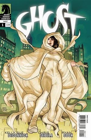
Written by Kelly Sue DeConnick and Chris Sebela
Illustrated by Ryan Sook and Dave McCaig
Dark Horse Comics
With knowledge of her past as ephemeral as her physical form, Elisa battles the demons that plague her city, sending them back to the Hell she herself is a part of, like it or not. With some amazing tricks up her sleeve (like the ability to turn an entire car into a ghost--wish I had that for I-95 traffic), Elisa wants to know her full history, but the cost may be prohibitive as this new series picks up on old threads.
Co-writers DeConnick and Sebela do their best to fill in new readers while not dragging down the overall story, and I think they do a pretty good job of it, even though Ghost as a character is pretty confusing. Starting off in the middle of a fight was a good touch, rather than a dragging talkfest of a recap. Giving Ryan Sook room to show off his amazing visuals is always a good thing. While his style has changed a bit, relying less on shadow than he did in the past (a pity, I loved that look), Sook's layouts are still very strong.
There's a lot of conflict in this one, as we're not quite sure if Elisa's fights are to help humanity or just regain her own, and the ending of this issue really drives that point home. I have a feeling it's going to go badly, building a new set of problems for a character who could use some definition. I liked this one enough to keep going into the next issue, though I admit I might not have if it weren't for the creative team involved.

Written and Illustrated by Bud Sagendorf
IDW
Popeye's domestic bliss is ruined when he turns into a hobo and stows away on a miniature rocket in another of Sagendorf's domestic comedies that's funny but gets stuck with a piece of racist dreck reprinted in the name of completeness.
I realize that there are lots of issues in older comics, in terms of treatments of women and minorities in particular, and that in certain cases, a pass might be given. However, those are often in collected book form, where the anthologist can put them in context for the reader.
In a floppy comic? It's just unacceptable. With so many other Sagendorf stories to choose from (I can't believe they're running out), why pair a perfectly good story of Popeye dragged all over the world by a runaway rocket with a "scheming indian" story, even if said Native American gets the better of his antagonist?
It's a questionable choice, to say the least. While I admit it's nice to see the role reversal, there's still far too much "Me thankum you" style dialogue and bald greed for my taste, making the character someone who's an unlikable trickster laden in stereotypes.
The Popeye story follows a familiar pattern by now, with him being the straight man dragged into adventures by his friends, in this case the King of Spinachovia. He's so upset he needs Popeye, but freaks when the sailor man wrecks everything in his haste to help. Full of great comedic visuals and wonderful lines, like Popeye's concerns about getting his feet wet, the story is just barely enough to make this worth picking up. It's just a shame I can't recommend this one without conditions.