*BOOK OF THE WEEK* (tie)
Mister Miracle 10
Written by Tom King
Art by Mitch Gerads
Letters by Clayton Cowles
Published by DC Comics
Published by DC Comics
The hype surrounding this issue is well-deserved. King and
Gerads have crafted a heartfelt meditation on the superhero genre and resulting
moral quandaries associated with utilitarian ethics. Mister Miracle 10 brings
the story to its final act as Scott and Barda talk both about and around their
potential sacrifice offered in issue 9. This issue is tragic, heartfelt, and
sincere. What King does so well in writing these conflicted characters is
create appropriate authorial distance, allowing the reader to process and draw
conclusions. He's a little heavier handed in his Batman run, allowing the Dark
Knight to insist upon himself, which might be how it needs to happen, to be
fair. But on Mister Miracle, he creates open spaces for the characters to flow.
There are twists coming, to be sure.
King could not be joined by any better a sequential storyteller than Mitch Gerads who has for the entire series created exquisite nine panel grids unlike anyone prior. Gerads uses the grid system to sequence events with such subtlety that King is free to amp up the conversational dialogue. I feel that both men have gotten better at this collaborative effort throughout the series. The shower scene page is probably one of the best pages Gerads has crafted for this series, and it offers a microcosm of sorts for the series as a whole. The fact that King fills the page with Barda's dialogue instead of Scott's is indicative of just what kind of writer he has turned out to be.
King could not be joined by any better a sequential storyteller than Mitch Gerads who has for the entire series created exquisite nine panel grids unlike anyone prior. Gerads uses the grid system to sequence events with such subtlety that King is free to amp up the conversational dialogue. I feel that both men have gotten better at this collaborative effort throughout the series. The shower scene page is probably one of the best pages Gerads has crafted for this series, and it offers a microcosm of sorts for the series as a whole. The fact that King fills the page with Barda's dialogue instead of Scott's is indicative of just what kind of writer he has turned out to be.
Grade – 9.5, for superb
storytelling and gorgeous presentation.
*BOOK OF THE WEEK* (tie)
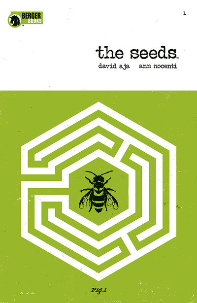
The Seeds # 1
Written byAnn Nocenti
Everything Else by David Aja
Published by Dark Horse
Published by Dark Horse
Ann Nocenti crafted my single favorite line in comics this
week, “You see him over there? Tell him people can’t go backwards. Not into the
future they can’t.” There’s something special about this book in the way that
Mister Miracle or Saga are very specific collaboration between two in-sync
creators. The Seeds is even more intense because Aja not only handles the art
and coloring, but also the lettering. I’m glad to see black and white comics
creeping back, and Aja’s green-tint-inflected black and white art is stark and
appropriately barren for this wasteland setting.
This issue is deep and it moves quickly. It’s the first of a four issue series, so Nocenti and Aja have to work quickly to establish the setting and the central conceit. Still, this issue doens’t feel rushed, mostly because of the six semi-over-lapping chapters that build this issue. Still, there are a number of big concepts Nocenti and Aja tackle in this comic, including the news media (clickbait and fake news, of course), the nature of a self-fulfilling prophecy, advanced technology, disease, immigration, mortality, sex, extraterrestrial life, and late capitalist economies. My favorite part of the book is the noir-inflected interaction between Astra and her editor, Gabrielle. It provides both character motivation and ties the book to familiar tropes. (There are two other superhero reporters, right?) This book comes incredibly close to beating out Mister Miracle for top honors this week, but let’s just call it a tie.
This issue is deep and it moves quickly. It’s the first of a four issue series, so Nocenti and Aja have to work quickly to establish the setting and the central conceit. Still, this issue doens’t feel rushed, mostly because of the six semi-over-lapping chapters that build this issue. Still, there are a number of big concepts Nocenti and Aja tackle in this comic, including the news media (clickbait and fake news, of course), the nature of a self-fulfilling prophecy, advanced technology, disease, immigration, mortality, sex, extraterrestrial life, and late capitalist economies. My favorite part of the book is the noir-inflected interaction between Astra and her editor, Gabrielle. It provides both character motivation and ties the book to familiar tropes. (There are two other superhero reporters, right?) This book comes incredibly close to beating out Mister Miracle for top honors this week, but let’s just call it a tie.
Final Grade – 9.5, for
innovative storytelling techniques and stellar art.

Batman # 52
Written by Tom King
Line art by Lee Weeks
Color art by Elizabeth Breitweiser
Letters by Clayton Cowles
Published by DC Comics
Published by DC Comics
After the fallout of the now infamous 50th
issue, I was somewhat surprised by how strong issue 51 was. I guess I
anticipated some sort of letdown, perhaps? Issue 52 builds on this success.
Look, we get it know. No one can write superhero slice of
life like Tom King. Not even Matt Fraction. I mean, he’s made a book about jury
duty one of the better books on the stands over the past month. I get it. It is
a story about Bruce Wayne being on jury duty for a Batman case, but still.
There’s a significant amount of pure Batman philosophy
swirling in this book, and a lesser writer would feel the need to verbalize
those dilemmas. Instead, King wisely trusts his art team, which is easy to do
with Weeks and Breitweiser. There’s a way Weeks deals with faces – specifically
Freeze and both a cowled and uncowled Bruce – that plays with shadows such that
there is increased emotional depth in this story, because, in the end, that’s
what this story is about – shadows, light and dark, gray areas - Batman’s very
existence. The solicit hints at Bruce hanging the cowl up for good, but – at
the risk of revealing spoilers – that’s not on the table in this book. Instead,
we have a Bruce Wayne whose motivations as the sole holdout juror are still
incredibly foggy, and we’ve got a hypothesis about another actor involved in
whatever landed Freeze in lockup.
I think we know what to expect in these kind of Tom King stories. This is the second issue of the arc. He's not giving us anything to go on quite yet. Because it’s King, the narrative is subtle and measured; it’s non-linear, and it’s inherently contemplative. Because it’s Weeks and Breitweiser, it’s gorgeous.
I think we know what to expect in these kind of Tom King stories. This is the second issue of the arc. He's not giving us anything to go on quite yet. Because it’s King, the narrative is subtle and measured; it’s non-linear, and it’s inherently contemplative. Because it’s Weeks and Breitweiser, it’s gorgeous.
Final Grade – 9.0, for a
strong core narrative and beautiful artwork. (I will say that I think this book
would look even better on the new DC matte paper stock. Just saying.)

Cosmic Ghost Rider # 2
Written by Donny Cates
Line art by Dylan Burnett
Color art by Antonio Fabela
Letters by Clayton Cowles
Cover by Geoff Shaw and Antonio Fabela
Published by Marvel Comics
Published by Marvel Comics
I am kind of out of the loop/behind the times when it comes
to Donny Cates’s Thanos work. I thought I would be able to pick up Cosmic Ghost
Rider a little easier, but I even found it hard to recognize Frank Castle.
Admittedly, I’m not incredibly well versed in The Punisher, either. In catching
up on Cates’ Thanos run, I figured I would jump in with Cosmic Ghost Rider. The
first issue rushed right into action with little explanation of important
elements such as “why” or “how.” But, even if I was a little lost, it was a
bonkers kind of book that was fun to read.
In Cosmic Ghost Rider, Cates ponders
the nagging “nature vs. nurture" theory as well as the barroom favorite,
“if you had a time machine, would you go back and kill Hitler?”
Interdimensional spacetime paradoxes aside, It's fun to watch Frank Castle
wrestle with metaphysical concepts. It’s also a treat to page through Burnett’s
art as he combines elements of Kirby, Starlin, and Allred into his work.
Burnett’s renderings of two of Marvel’s biggest cosmic entities is enough to
warrant a purchase of this issue, but Cates’s devil may care approach to the
storytelling is what drives it home. In fact, I think I’m happy that I didn’t
have much background knowledge stepping into this series. It’s all the weirder
for it, and that’s kind of the point of this series, isn’t it?
Final Grade – 9.0, for an over
the top romp that turns the dial to 11.

2000 AD Summer Sci-Fi
Special
Written by Leah Moore, Emma Beeby, Alex de Campi, Laura Bailey, Katy Rex, Tillie Walden,
Olivia Hicks & Maura McHugh
Line art by Dani, Abigail Bulmer, Babs Tarr, Liana Kangas, Sam Beck, Xulia Vincente & Emma Viaceli
Color art by Eva De La Cruz, Gab Contreras, Pippa Mather & Barbara Nosenzo
Letters by Annie Parkhouse, Ellie De Ville & Tillie Walden
Cover by Tula Lotay
Featuring a Judge Anderson poster by Maugerite Sauvage
Published by 2000AD/Rebellion
Published by 2000AD/Rebellion
The issue itself is an incredibly solid mix of stories
featuring premier 2000 AD characters. The stories range from over the top
demonic metal absurdity to touching sci-fi inflected slice of life strips. It’s
a real treat, in that It's both novelty to American audiences and well-executed
in its own right.
Final Grade – 9.0, for eight
fully executed stories that each pique the interest of 2000 AD newbs.

Adventures of the Super Sons 1
Written by Peter Tomasi
Pencils by Carlo Barberi
Inks by Art Thibert
Color art by Protobunker
Letters by Rob Leigh
Published by DC Comics
Published by DC Comics
In this new volume, Tomasi keeps his foot on the gas as
Damian and Jon still bicker. His control of
these characters is remarkable. Barbieri and Thibert are excellent
collaborators for this book. Barbieri’s animation style pencils and Thibert’s
thick inks combine very well with the colors. (By the way, why hasn’t DC
made a Super Sons animated movie yet? Or television show? Come on. I mean, grow
your goddamned brand.) This issue falls in with the previous
volume perfectly. It’s fun and cheerful in a way that you wouldn’t necessarily
expect from a story about two boys battling a mind-controlled statue destroying
a city. It’s hard to get much more into this story without spoiling the big
reveal at the end of the book, which makes me just a tad skeptical of the
direction of the next 11 issues.
Final Grade –8.5, for a strong
start but a “jury’s still out” ending.

Justice League 5 (Legion of Doom 1)
Written by James Tynion, IV
Pencils by Doug Mahnke
Inks by Jaime Mendoza
Colors by Wil Quitana
Letters by Tom Napolitano
Published by DC Comics
Published by DC Comics
I haven’t loved the current Justice League book. I
enjoyed No Justice well enough, but I haven’t gotten into this core book. I get that
Snyder is going for a throwback feel with both the narration and pacing, but
it’s just not jibing with me. I’d like to see the series kick it into gear, and
I was curious to see if this Legion of Doom issue, written by frequent Snyder
collaborator, James Tynion IV. JTIV has shown he has a knack for team books,
but there’s a fine line for handling a villain book, especially one that
deliberately tries to tap the nostalgia gene. Moreover, the fact that a few of
these villains have become far more complex than their original iterations
provides a new complication. Luthor’s heel turn wasn’t entirely unexpected, but
his character was rather dormant since the end of the Imperious Lex storyline.
Sinestro’s history has leaned towards tweener since Blackest Night. And,
perhaps most notably, the Joker has, for about thirty years now, been portrayed
as an entirely unpredictable psychopath, far from the “Clown Prince of Crime”
of the Batman 66 or Animated Series conceptions.
There’s something about third person omniscient narration in
a comic that kind of irks me, but I think Tynion has a better control of it
than Snyder. I love Scott Snyder’s work, but his narration has been a little
ham fisted. There’s too much passive voice, and a style that recalls “It was a
dark and stormy night.” Tynion starts off in this direction as well, but
something happens in this book that steers it back into the right direction,
and I’m not sure exactly what that is. It’s a good story, especially for those
of us who have been eager to learn the origin of this current Legion of Doom incarnation
and, perhaps more urgently, Luthor’s rationale for his re-embrace of evil. And
perhaps that’s just it – this style works, or at least works better, for a
Luthor/Legion of Doom book.
Moreover, credit Tom Napolitano for knowing what to do with about a million narration boxes in this book. He spaces out the narration and dialogue bubbles well so that they don’t present too much distraction. I’ll say this, though – Doug Mahnke, Jaime Mendoza, and Wil Quitana should be the art team for all of the Legion of Doom iterations. I forget sometimes how good Mahnke is at drawing villains, especially Sinestro. This trio has a great control of the dark-light contrasts that make a villain-centric storyline ooze with the necessarily evil without overdoing the dark pallet.
Moreover, credit Tom Napolitano for knowing what to do with about a million narration boxes in this book. He spaces out the narration and dialogue bubbles well so that they don’t present too much distraction. I’ll say this, though – Doug Mahnke, Jaime Mendoza, and Wil Quitana should be the art team for all of the Legion of Doom iterations. I forget sometimes how good Mahnke is at drawing villains, especially Sinestro. This trio has a great control of the dark-light contrasts that make a villain-centric storyline ooze with the necessarily evil without overdoing the dark pallet.
Final Grade – 8.0, for a
strong finish and stellar artwork.

Weapon X 21
Written by Greg Pak and Fred Van Lente
Line art by Ricardo Lopez Ortiz
Color art by Frank D'Armata
Letters by Joe Caramagna
Cover by Rahzzah
Published by Marvel Comics
Published by Marvel Comics
I enjoy Ricardo Lopez Ortiz's artwork. It reminds of an
over-the-top Sergio Aragones. The tough thing about his art, though, is that
you kind of have to "get into it." Despite working on the most recent
issue of this series, his art is a definitive departure from all previous creators in the series. This is one of the many downsides to constantly shifting
artists. There is a lack of consistent tone, which is not the worst thing in
the world, but it's kind of jarring mid-arc.
I actually think Ortiz's artwork would be a welcomed addition to the book;
it would give it an alternative feel, separating it from the mainstream X-Men
books.
The return of Pak with Van Lente to the book helped to take it in a better direction after the somewhat drawn-out crossover that started the series. Nonetheless, this issue signals a change in the Weapon X dynamic, closes a chapter on Logan and Warpath, and sends the team into a new direction with a somewhat predictable last page reveal (especially if you've seen the cover or solicits for issue 22). As a single issue, this book is mostly falling action. The primary storyline condenses fairly quickly, perhaps too quickly and a somewhat too convenient ex machina character reveal doesn't help the scattershot pacing. The wrap up feels a little rushed, and the "Sabretooth gonna Sabretooth" philosophy feels a little lazy. Nonetheless, this is a fun book, and it stood out this week because of Ortiz. The biggest downside is that he won't continue with these characters.
The return of Pak with Van Lente to the book helped to take it in a better direction after the somewhat drawn-out crossover that started the series. Nonetheless, this issue signals a change in the Weapon X dynamic, closes a chapter on Logan and Warpath, and sends the team into a new direction with a somewhat predictable last page reveal (especially if you've seen the cover or solicits for issue 22). As a single issue, this book is mostly falling action. The primary storyline condenses fairly quickly, perhaps too quickly and a somewhat too convenient ex machina character reveal doesn't help the scattershot pacing. The wrap up feels a little rushed, and the "Sabretooth gonna Sabretooth" philosophy feels a little lazy. Nonetheless, this is a fun book, and it stood out this week because of Ortiz. The biggest downside is that he won't continue with these characters.
Grade – 8.0 for a rushed
finish and a "been there done that" kind of ending.

Animosity # 15
Written by Marguerite Bennett
Line art by Rafael de Latorre
Color art by Rob Schwager with Dee Cunniffe
Letters by Marshall Dillon
Published by Aftershock Comics
Published by Aftershock Comics
Final Verdict – 8.0 for poignancy and
thoughtfulness.

Bloodstrike # 24
by Michael Fiffe
Shorts by Various Creators
Published by Image Comics
Shorts by Various Creators
Published by Image Comics
I’m a big advocate of getting more cartoonists into
superhero books. I think there’s something special when one person creates and
executes an entire issue. Like Ed Piskor’s X-Men: Grand Design, Fiffe brings an
approach that we don’t often get to see in mainstream comics.
It’s kind of funny to see how Fiffe reimagines Cabbot Stone
with some Deadpool tendencies – capable, reluctant, disrespected. Perhaps that’s an homage to Liefield. I was
curious as to how Liefield secured Fiffe to work on this short series,
essentially a pair of 24 year belated fill-in issues. After reading the letters
column, though, you get the sense that Fiffe has a fondness for early Image
products. But you don’t necessarily need the same fondness to appreciate this
brief series. Continuity isn’t important. The storyline is a riff on the genre,
and the characters exist as meta-commentators. There’s no fourth wall breakage
here, but there’s a definite wink-wink approach. But again, this is a series to
appreciate for the artwork, the experimental coloring, and the wonky panel
designs. Copra is indeed a more fleshed out narrative, and likely Fiffe’s
magnum opus. Bloodstrike is his concept album.
Final Verdict – 8.0 because I guess it would be
nice if it made a little more sense.