The Warning
Written and Illustrated by Edward LaRoche
Colors by Brad Simpson
Letters by Jaymes Reed
Colors by Brad Simpson
Letters by Jaymes Reed
Published by Image Comics
The Warning is an excellent "slow burn" of a series that, through 10 issues, tracks an alien incursion on Earth and the military response to that incursion. It's a story that somehow feels both distant and personal, and both contemplative and technical. It's also a fantastic-looking, immersive book with terrifically-paced action. It's absolutely a great read for military/sci-fi comic fans.
It’s a stressful time. Aliens have invaded America. There’s an enormous object in Burbank, California of alien origin. No one knows what it is and it’s difficult to approach due to electrical interference. It also appears to just be a harbinger of more terrible things to come. But not to worry, our government has a plan, called Operation All-Weather. For an unconventional situation they’ve come up with an unconventional solution; creating chemically and physically enhanced super-soldiers that are also linked to certain military technology, whether it’s a machine gun, a sniper rifle, a fighter jet or a motorcycle. Through ten issues of The Warning, we move back and forth in time and see both the climactic engagements with the aliens, and all of the various events leading up to those battles. The story focuses on the four super-soldiers, but also spends some time with the scientists behind the modifications, and with the aliens themselves. We don't learn a lot about these aliens, but they really don't seem to like us (I can't say I blame them).

When I use the term “cinematic”, I’m referring first to the choice of framing and camera angle. There are a lot of shots looking up at characters, giving them an impressive and imposing appearance. In the background we can often see blurry images of objects in the distance. This conveys a sense of scope and grandeur, and does in fact feel "cinematic" in the best possible way. This effect is also used in regard to entire backgrounds in The Warning, where these backgrounds appear slightly out of focus relative to the foreground action. Not only does this convey a sense of dynamic motion, but it also feels very true to what our eyes see when observing real life objects.
In addition to creative camera angles, and effective use of out of focus backgrounds, I want to make clear that LaRoche doesn't just know how to make "cool-looking" shots (although he does). LaRoche is a gifted sequential storyteller, as adept at portraying intense action as he is at more meditative moments. There are a number of different sorts of challenging action sequences throughout the story and I think that LaRoche depicts them skillfully and (even more important to me) clearly. I have a sense of what’s happening from one shot to the next. And when there is any confusion, it feels very much by design (and not simply a lack of clarity). Whether it’s crowded urban combat or an intense aerial dogfight, LaRoche is highly skilled at both storytelling and pacing of action sequences. The book feels breakneck at times, but also balances that out with a number of quieter, slower sequences.

I really enjoy LaRoche’s linework. He’s got a very engagingly realistic style that reminds me in a very general sense of the work of Michael Lark (particularly in Lazarus, another series full of gritty, futuristic military action). Not in the specific style so much as a commitment to accuracy and general realism when it comes to people, geography, physical objects, and a grounded sense of spatial awareness. When reading a comic set mostly in military and other battle situations, I hope for an artist that can effectively sell the world in which the story exists (e.g., bring to life a city, dueling aircraft, a motorcycle, a space station, and plausible-looking aliens). LaRoche very effectively brings all those things to life. He also uses interesting perspective in certain situations, a narrowing or widening of perspective that gives almost a “fisheye” look to the scene. It reminds me of other similarly interesting design in Greg Tocchini’s artwork in Low.
 In conveying that sense of grandeur and scope, a huge part of the success here is due to the work of colorist Brad Simpson. Simpson does stunning work, such as in the above panel. There’s lens flare reflecting on a character’s face, and the light emanating from the plane above, really gives the panels a cinematic “you are there” feel. The character are also colored in a slightly “shiny” way (I don’t really know a better way to describe it) such that it conveys a sense almost like we’re looking at single cels from a roll of film.
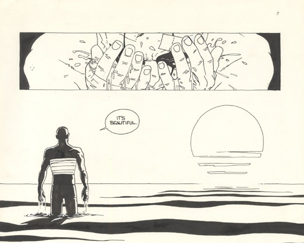
In the above dogfight panels, the light similarly conveys a sense of realism. The first panel conveys a very closeup sense of motion. And the second panel shows a split second glimpse of the plane in flight. And the third panel is a closeup on a character’s eye; it’s depicted in a just slightly blurry fashion, which really gives the sense of the intense vibrations that something like a jet engine would be causing (so you really feel the intensity of the moment). And the final panel on that page shows the plane in context of its surroundings, in an urban area and close to the other plane. All of these together make for an engaging, intense action sequence with a high degree of “you are there” verisimilitude. This seamless combination of line work and color and visual effects feels incredibly well thought out, and The Warning is full of similarly engaging sequences.

So definitely pick up The Warning. It's an entertainingly told military-action sci-fi story. You'll be engrossed by the story, and absolutely blown away by the creative and innovative art and visual storytelling. I'm excited to see what LaRoche does next.