HeroesCon is one of our favorite shows, and we wanted to highlight some of the terrific comics creators that will be there. You can find all of our HeroesCon coverage here.
You know how peanut butter is great, and chocolate is great, but when you put them together it's just magic? Well, the same is true for the work of illustrator Ryan Bodenheim and colorist Michael Garland. I'm a huge fan of each of their work independently. Garland is terrific colorist with a diverse skill set, such as on The Black Monday Murders where he seamlessly moves between "gritty procedural" and "insane dark magic". Bodenheim is the artist on the terrific, darkly clever superhero story Halcyon, another one of my all-time favorites. And together, they're the art team on some really special comics, and their work complements each others strengths.
You know how peanut butter is great, and chocolate is great, but when you put them together it's just magic? Well, the same is true for the work of illustrator Ryan Bodenheim and colorist Michael Garland. I'm a huge fan of each of their work independently. Garland is terrific colorist with a diverse skill set, such as on The Black Monday Murders where he seamlessly moves between "gritty procedural" and "insane dark magic". Bodenheim is the artist on the terrific, darkly clever superhero story Halcyon, another one of my all-time favorites. And together, they're the art team on some really special comics, and their work complements each others strengths.

Bodenheim has a dynamic yet intricate style, and is a terrific comic
storyteller. He has a fantastic sense of place and geography, such that
within very few panels he can very precisely bring a particular world or
setting to life. As shown above in a page from Red Mass For Mars,
the reader is immediately pulled into a world of terror, environmental
degradation, and unspeakable horror. The rot, the decay on corpses and
dead animals, and all of the wrinkles and lines and hairs on a
horrifically sick patient - Bodenheim knows how to very quickly bring
all of that to life.

He's got a fantastic artistic partner in Garland. I would, in only the most general sense, describe Garland's color choices (in his collaborations with Bodenheim) as "atmospheric", as they strongly differ from one work to another. In Red Mass For Mars, the color choices are often larger than life, highly exaggerated, and the characters spend a great deal of time either in space or looking to the sky (hoping for a hero to save them) and so many of the panels have a "cosmic" feel to them - this color palate extends beyond the sky itself, directly to the characters on the immediately above page, making it feel that these characters are themselves part of the cosmic firmament.

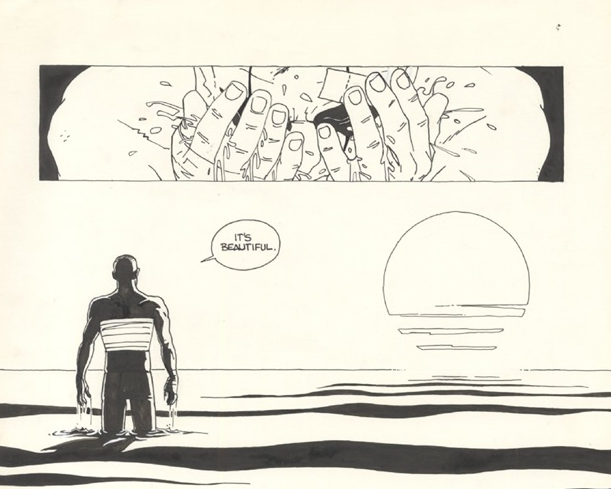
Bodenheim has a great grasp of human anatomy, and is a fantastic artist when it comes to facial and body acting, and the intricate details of each character. Each character looks unique physically, and in their respective body language. Bodenheim also just puts a lot of detail into each character, so in the above panel you can really feel all of the wrinkles on the man's pajamas as he is fearing for his life. One of the places that Bodenheim's storytelling comes through is in his characters' eyes. Eyes are a real strength of Bodenheim, as in the above panel from Secret which vividly brings to life the shock and fear one character is experiencing, and the ruthless, predatory nature of the other character (which can be keenly felt in his eyes). Bodenheim's grit and detail recalls a little the work of Steve Dillon and Juan Jose Ryp (excellent company to be in) but is very much his own style.

The above panels from Secret are also spectacular illustrations of Garland's creative color choices. As above, where the attacker is colored in bloody red, and the rest of the book is in muted, monochromatic grays and browns. Secret is a story of the violent, brutal world of industrial espionage, and of bad men who do bad things - and the red is there to foreshadow or highlight fear, or violence, or both, such as in the below page, where in the bottom panel, Garland chooses to color only the reflection of the boys in the blade. It's not subtle, but it's visceral and really conveys the point. This is a grim world, where sometimes the only color is the color of blood being shed.

In The Dying and the Dead, both Garland's and Bodenheim's skills are on full display. Bodenheim brings numerous different locations to life, whether it's a Mediterranean villa, a dusty old hospital, or a super-ancient underground city that defies all logic, Bodenheim brings his terrific eye for details both big and small to the story. Garland again makes atmospheric, monochromatic color choices that really work to set a mood more effectively than realistic color choices might. Above we see a gorgeous twilight, and below is the antiseptic, somewhat run-down colors of an old hospitals. But Garland is also making a deliberate color choice regarding the below non-human characters. They're bright white, and shown in a way that's meant to be almost difficult to look at. Their contrast to their surroundings jumps off the page in an unsettling way, and in the below page, the woman's cold beauty and disdain (or even contempt) for her surroundings comes clearly across.

I recommend picking up anything by Bodenheim or Garland, and I (clearly) strongly recommend picking up the comics where they bring their tremendous skills together.